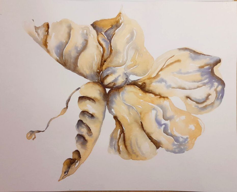
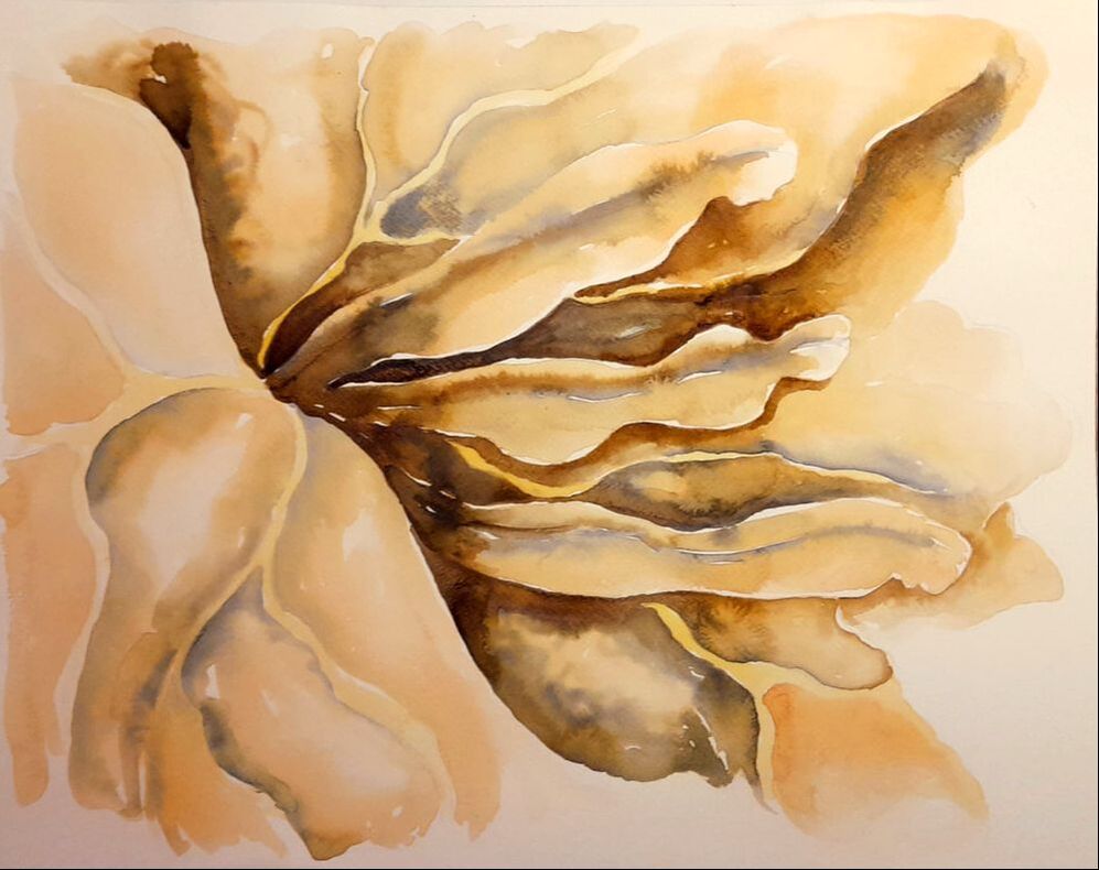
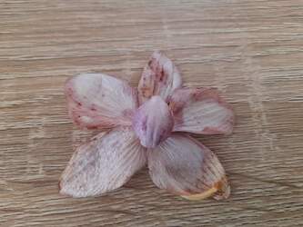
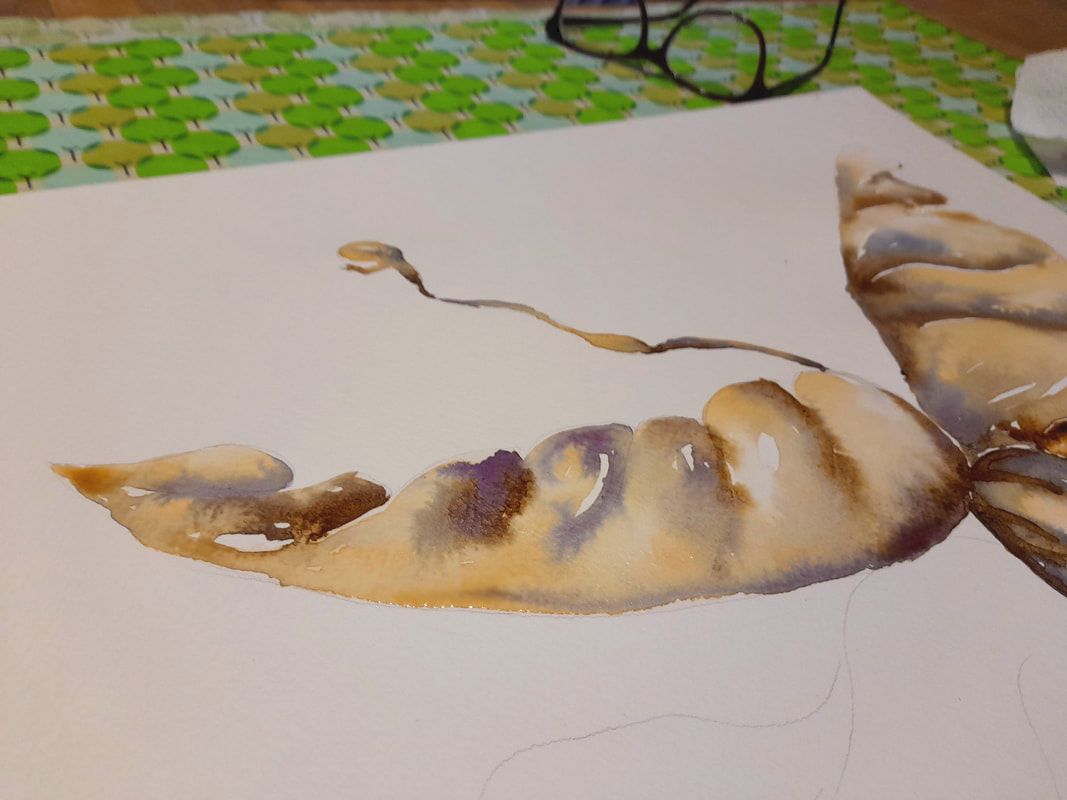
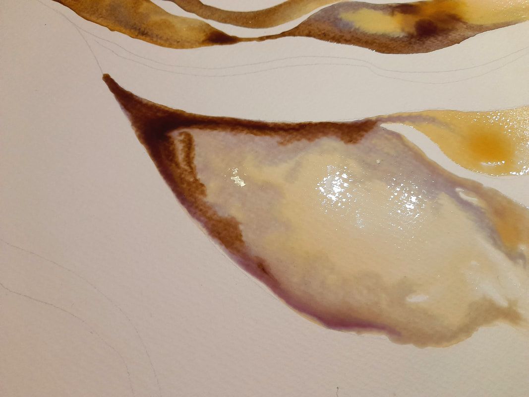
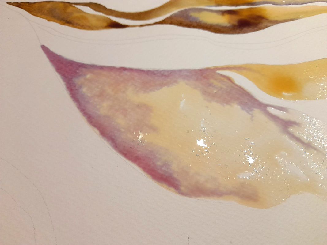
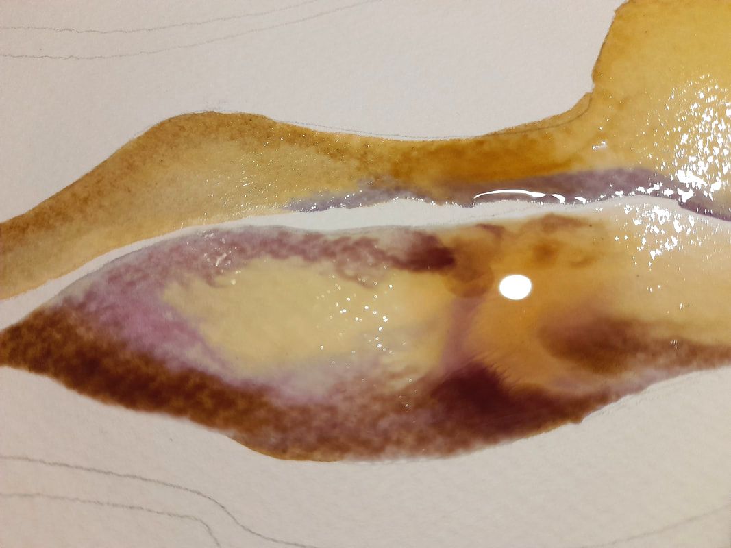
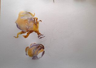
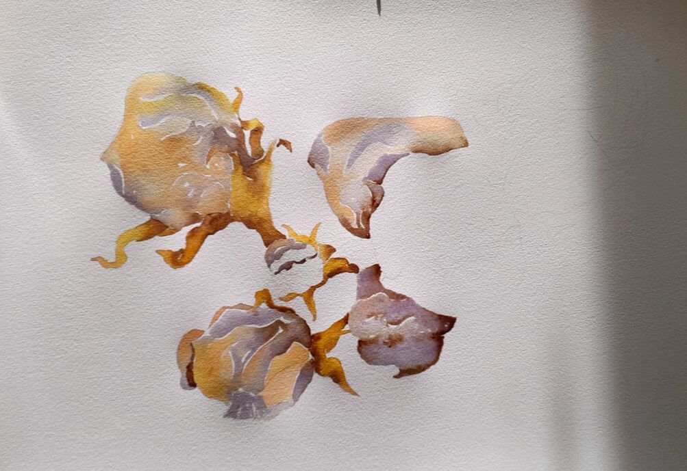
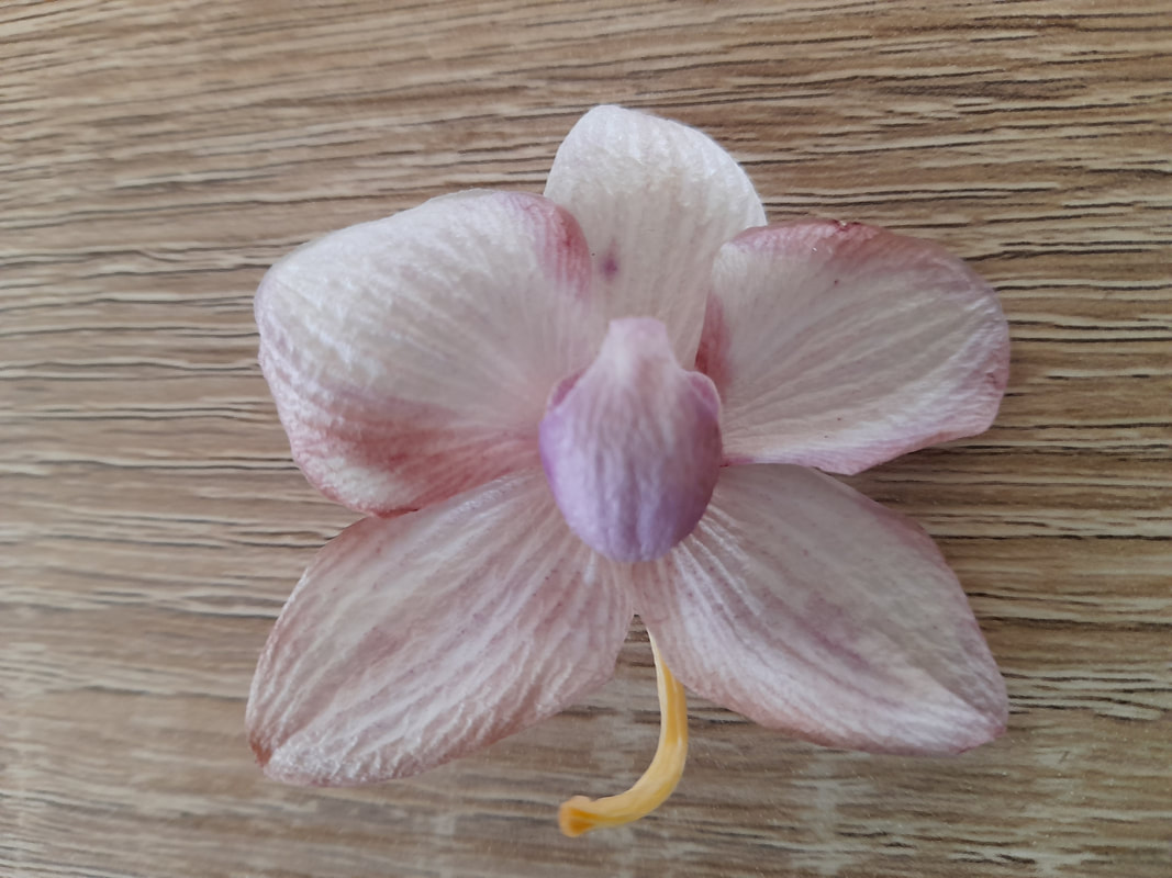
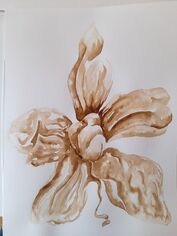
 One last flight - Orchid butterfly. 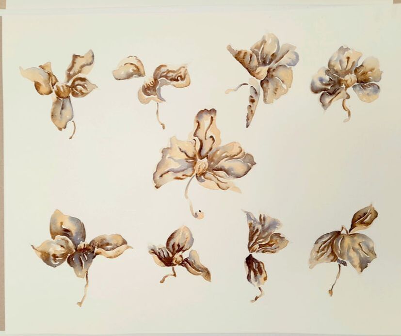 Orchidarium - swan song for butterflies-orchids As a child I never found orchids so interesting, all the woman in my family loved them and orchids were everywhere. As a child I was turned off by the pink colour, my colours were blue, dark violet and green, so I loved bluebells and wild flowers. But then I reconsidered, looking closer orchids are wild marvels from another time, their petals carry the echo of prehistory. In the new home, we inherited a vase of small pink-white orchids, and I was astonished by looking at them blooming and withering. Orchids are fleshy, strong, and inspiring: When orchids are alive and fresh, the form and relative size of the petals reminds of oneiric images of birds flying free. When they start to dry, orchids can look like new born baby embraced by the petals, still with a umbilical cord attached. I have painted this subject with onion and coffee ink, and posted about it in May 2023.
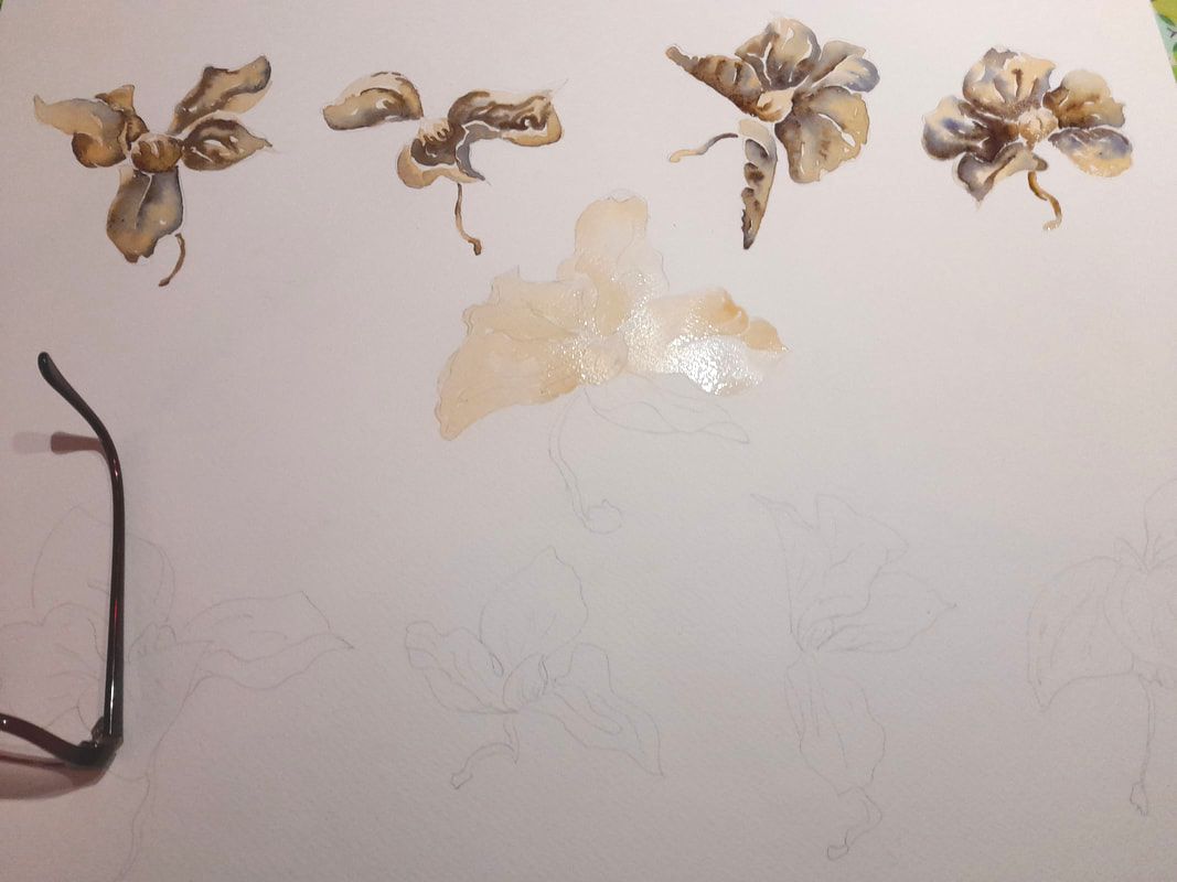
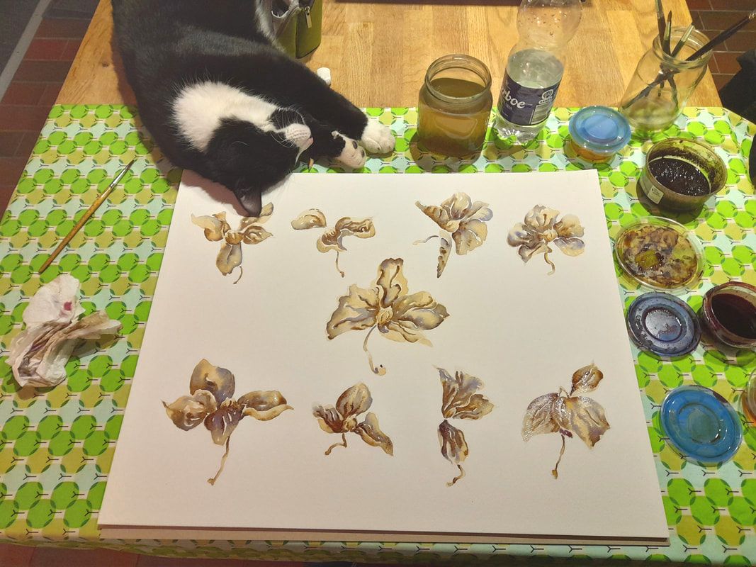
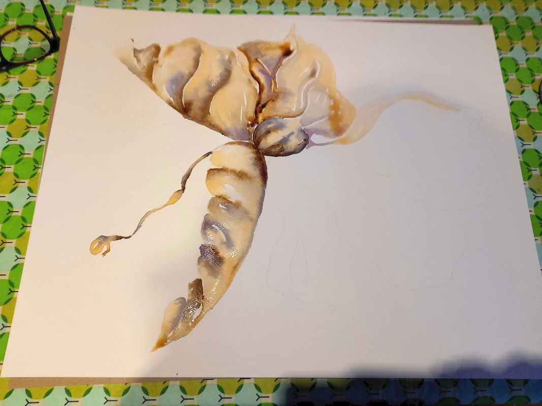
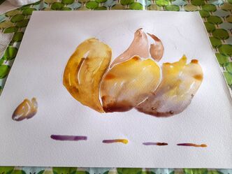
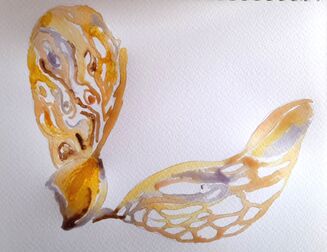
But when orchids are dry and dead, the same petals remind of the wings of dead butterflies or mosquitos reunited in a scientific collection. When dried, the lack of water make orchids acquire a golden hue, the petals become thinner, more wrinkled and lose their fleshy quality. From wild, through aging, orchids become frail, yellow, wrinkled, thinner and semi transparent. From birds, old orchids turn into insects, their wings bent and crumpled. 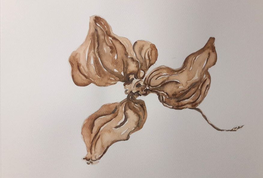 So, as a good naturalistic collector, I made my own imaginary butterfly collections of dry orchids. I collected the dried orchids which were dying from our plant for over a month, circa 3-4 weeks, and I framed them as if making a butterfly collection. And then of course I have painted them, you can see the result on the top of this post. 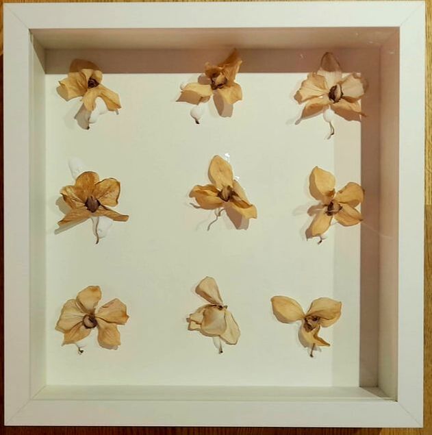 I painted the whole collection or orchids-butterflies, as if it will be part of a painted cabinet of curiosity, representing rare naturalistic beauties. And then I focused on one single flower, which from a certain angle, really looked like having a butterfly body. Here you can see some of the phases of the paintings:
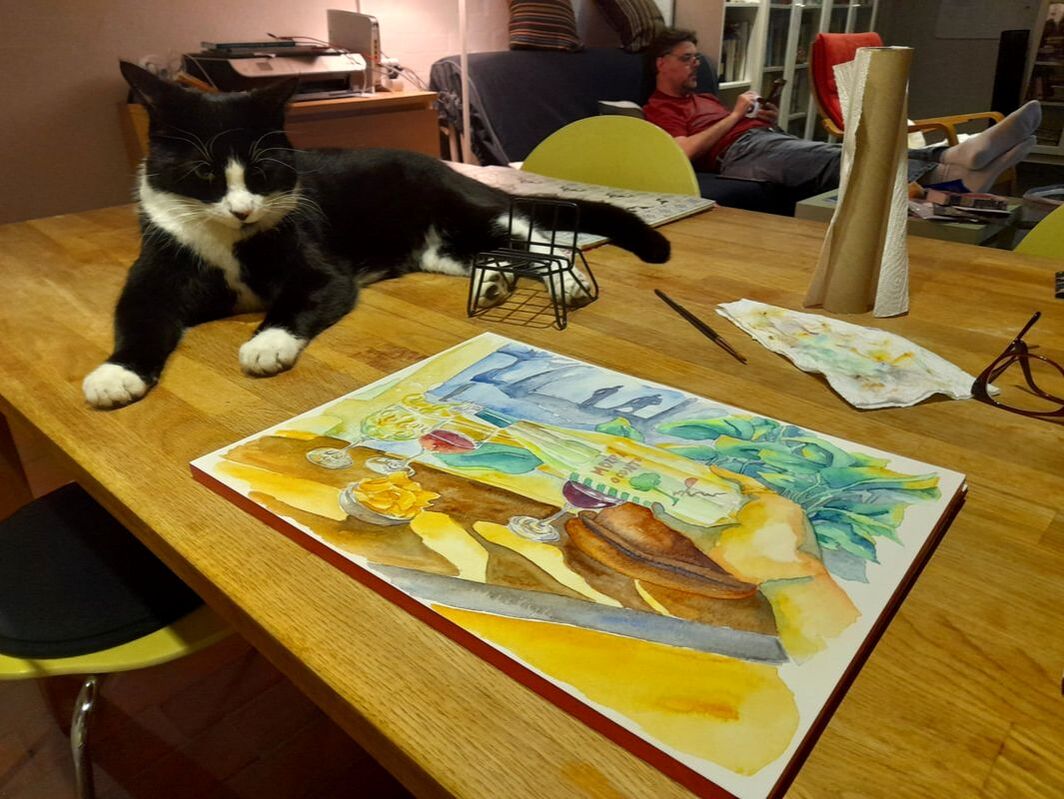
Our tuxedo friend Khorne was keeping me company while taking a nap in the process ;)
These paintings were created for Spinderihallerne and the exhibition we are organizing together for June 2024. I used organic colors made by ourselves with onions, cranberries, and coffee. Thank you for stopping by Bertie xxx
0 Comments
Under encouragement of my colleague, Heidi, I have edited a calendar with a selection of my watercolors. I did not do it last year, it was not a very good Christmas and I did not feel like. This year I wanted to shake things a bit, I am exhausted and not looking forward too much to start working. However, some nice things are happening, my collaboration with Spinderihallerne is going on, I am working on the paintings and the activities to conduct with a local school. My daughter has turned 18 and my husband and I are now working under the same department and the same research group. Anyway, I have collected a series of watercolors that I have created over the past 2 years from 2021 to 2023, combining different subjects such as:
I have edited the calendar in a classical multipage format, with a round mark for cutting a hole and hang it on a wall, there is room enough for a spiral once printed. And I have also edited a 1-page format that can be printed and hung as a poster. Anyway, both calendars can also be used in a digital format, also as desktop image. You can find them in this page in PDF and JPG for the 1-page version. 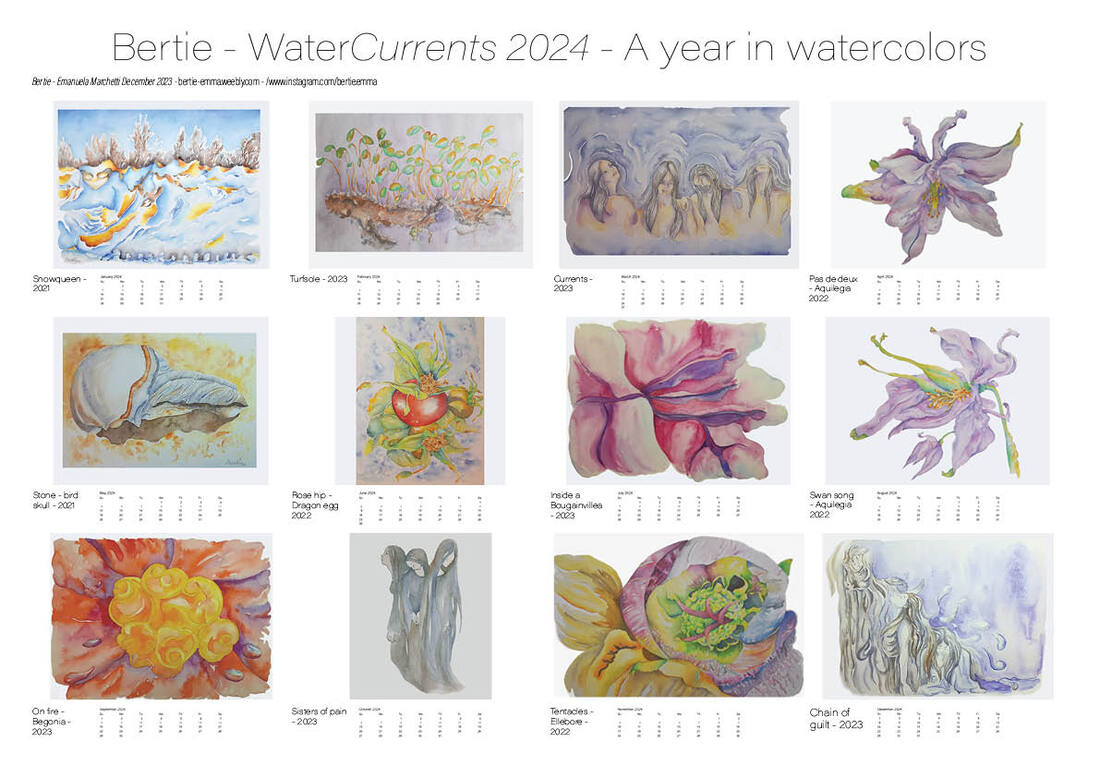 I hope you will enjoy it, thank you for stopping by Bertie xxx
 Bougainvillea Moving forward in my bougainvillea, Soon to be done. My brush caressing the paper, human forms emerge from the petals. Their feet anchored at the core of the flower, as we humans, men and women, anchored on the ground, in nature, in our DNA, mirroring ourselves in other living organisms: limbs, spheroids, ellipses, all shaped by the same physical forces. 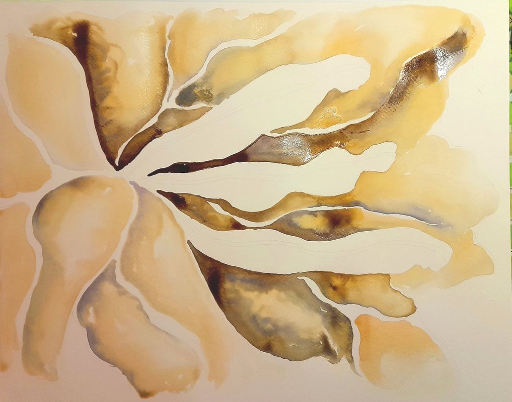
I worked at this piece starting from a picture I took during our holiday in Fuerteventura, visiting my in-laws. The nature in Fuerteventura is stunning, rough and primitive, as if showing how it could have been to survive in Prehistory, in a hostile territory, when life was young on earth. The territory is desertic, sand and rocks, dunes and rocky hills draft a predominantly ochre landscape. The sun is shining and golden, casting its hot beams without worries. Wherever water is available, succulent plants and flowers emerge dramatically and full of life, as if they were just looking for the right spot to occupy for themselves and their descendants. The various colors of the flowers shouting a desire for survival, wrinkled petals, contracted in an effort to be nourished by the sun, the air, and the water, often not sufficient when left alone, people take good care of their flowers, emanating their rich colors, hope for the future life on the island. This is another organic painting I did for my collaboration with Spinderihallerne, a botanical painting made with organic inks. Mixing the colors means to mix nature juices. First the light tones, the fleshy onions, with their warm delicate peachy hue. Then a gentle touch of cranberries, organic colors of flesh and blood, bleeding into one another, like looking into a cell living processes. Finally coffee drops, brown warm shadows, like the shadows cast by the hilly rocks on the sun burnt island. Coffee as combustion, the cranberry juice turns blueish by oxidation, the painting is pulsing with life, the juices flow as through living tissues. From the heart of the flower, which is not technically a flower, three subtle human figures emerge, as if standing on their feet from the centre of earth. Soldiers facing the harshness of life in this desertic island? An echo of the survival of primitive humans on earth. Working with these organic ink provided a limited palette, not matching the luxurious hue of a purple bougainvillea. As the painting takes its form, its a different flower I painted than the one I have photographed. Colors are carrier of meaning, the natural purple flower has been shifted towards yellowish-peachy-brown hues, suggesting the color of human tissues and the warm color of sand.  Thank you for stopping by and Merry Christmas :)
xxx Bertie It has been an intense semester and I have continued working on the botanical paintings for the project we are conducting with. The concept of taxonomies have become increasingly central to the work of Shanice and myself, as we act as collectors:
But we are also creating a collection of artefacts:
In this post I wanted to show a series of botanical tables, painted like in the old days, to represent a naturalistic catalogue about the plants that we can find walking around in Danish cities, in public parks and green areas surrounding the cities. In Denmark we are lucky, because there is great focus on keeping beautiful green areas close to the cities. Lots of trees, bushes, flowers, mushrooms, and of course cute animals as well, are a constant part of the landscape, without having to drive many kilometers towards the countryside. Some of these plants are even edible, it is common place to find hazelnuts, I have a series of lines of hazelnuts just beside my house, apple trees, tall cranberry and thick blackberry bushes are easy to spot when in season. The presence of these plants is providing beauty, lifting the spirits of citizens even when living in urbanised areas, inspiring art making, like in my case, feeding us and reconnecting us to the seasonal cycles. We do not just see the changing colors of leaves, but we experience the whole life cycle of nature, from leaves, to flowers, fruits and seedpods appearing to plant other trees. 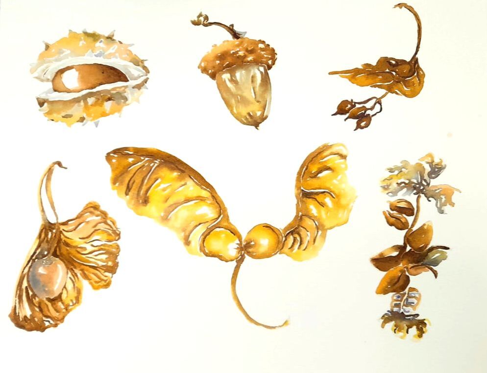 From top left - chestnut, acorn, linden. From bottom left - ginko biloba, sycamore or maple, birch, a classical Nordic tree. 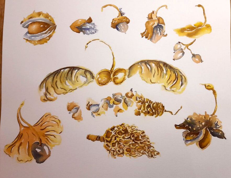 From top left: chestnut, poplar, acorn, hazelnut, linden. Center: sycamore or maple and birch. From left bottom: gingko biloba, magnolia, and I am not sure what the last one is, I will try to find out ;)
The colors are gained from: turmeric root for the yellow, onions for the flesh pink color, which is providing a delicate warm tone to the paintings, cranberries and blackberries and cabbage for the violet-blue, and finally coffee for the darker tones. Anyway the cranberries ink added in layers tend towards darker tones, turning into almost black, even more when mixed with coffee, while gaining a warmer nuance. Although I claim I am doing botanical paintings, in fact I am still exploring how living organisms mirror into each other. I tried to capture the lightness of the movement expressed by the forms of these seeds, some converging towards longneck birds ready to fly, gazing at far horizons to be reached. Thank you for stopping by Bertie xxx 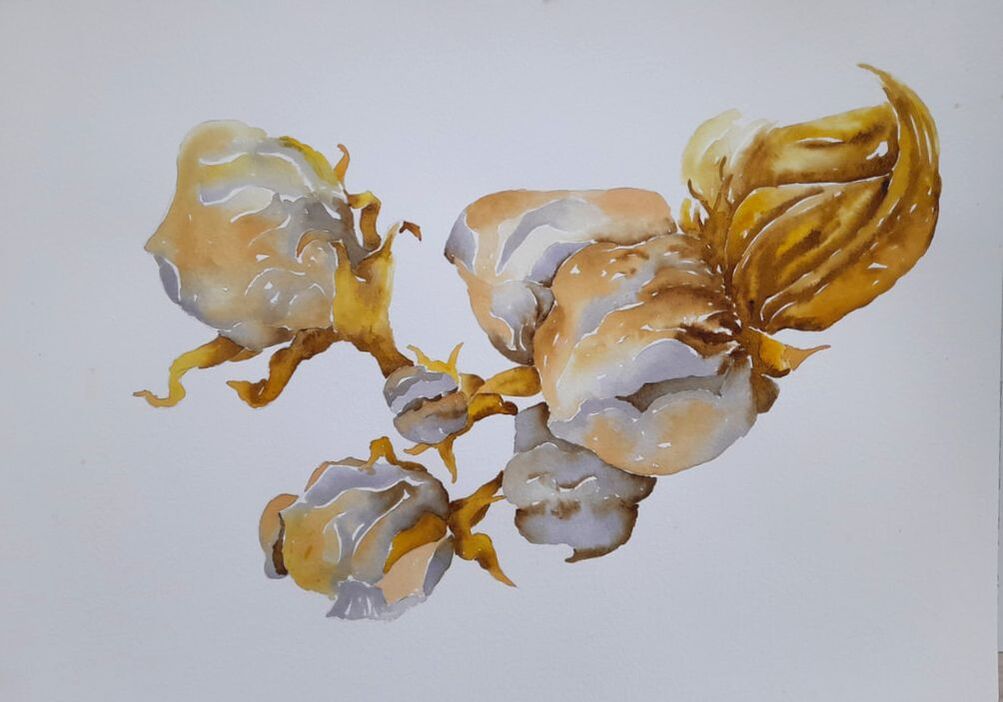 Experimenting further with organic inks together with my friend Shanice from the Biotech lab at Spinderihallerne, she inspired to try further in making inks. There are huge blackberry bushes just behind my house, some are good to eat, most of them are not ;) So having browsed among different recipes online and having taken pictures on my phone, of Shanice's recipes, I tried to experiment more. So I went to pluck a bowl of blackberries and I started making ink. I have boiled the berries, sieved them, added Arabic gum, salt, white vinegar and alum dissolved in boiling water. These substances should secure that the colors will no fade to sunlight or over time, and the vinegar is supposed to avoid the formation of bacteria and prevent the pigments to rot, being vegetable based it is a risk. I poured everything in a clean jar and I was ready to paint :) 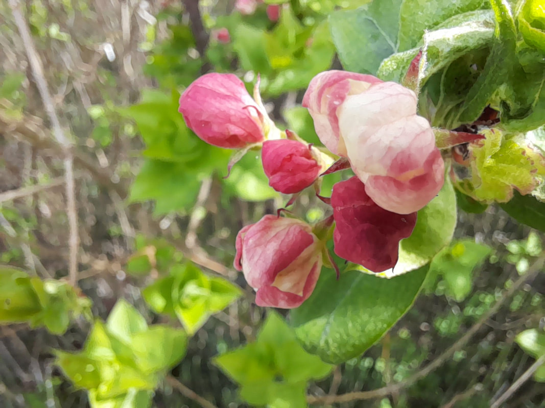
In this painting I have experimented with this picture you can see above, which I took of the apple blossoms that were growing on the apple tree in our garden. I focused on the way each line and curve, and their change in direction inspired me, forgetting that I was drawing flowers. The forms of the apple blossoms to me recall the forms of contracted round faces, their wrinkles drawing pointy curves of closed eyes and mouths. I see these blossoms as small newly born organisms, contracted in the effort of surviving, eager to develop and feed themselves with sunlight and rain. I used from Shanice her pink onion ink and her bright yellow turmeric ink, the paste pigment I gained from coffee, and the new ink I made from blackberries, which looked like a liquid dark warm purple, but when painting it turns into a colder blueish violet. It might even turn to dark grey, when applying many layers on top of each other. You can see above two images from intermediate stages of painting the apple blossoms. And down here you can see the blackberry ink in the making. 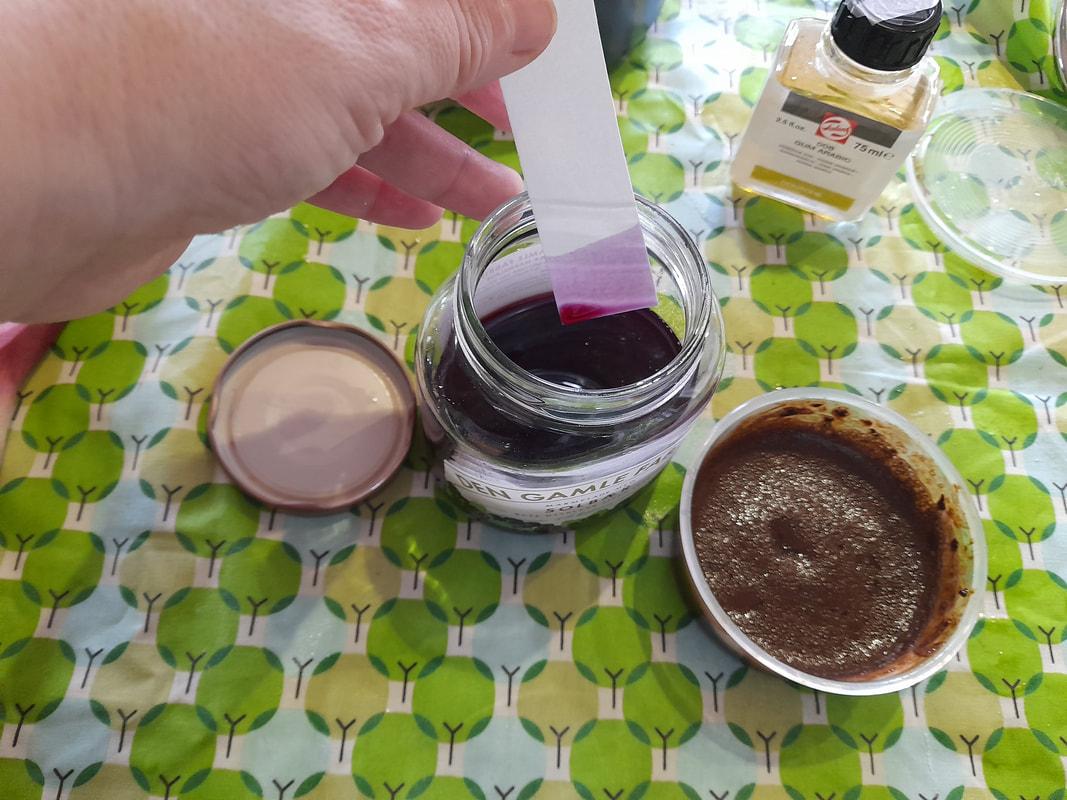 As you can see, in the test paper freshly dipped into the ink, the hue is of a worm pinkish purple, but when it dries it turns a blueish violet, probably because of oxidization of the pigment. You can see the changes also here in these test sketches I made, where I also tried to mix it with other pigment.
In the image above on the left you can see the blackberry ink mixed with the yellow turmeric and the pinkish onion, which can be an excellent hue for flesh colors. Turmeric yellow is extremely staining, you can see the yellow stain in the bottom round shape of the drawing on the right, which is supposed to represent a helicopter seed, transfigured into the carved wings of a dragonfly. As you can see, in the round junction of the wings, there is a thick, opaque stain of yellow. This stain is produced by the turmeric yellow ink, when applied on the paper, either pure or when the water on the page is almost dry or definitely wet on dry. The best way to control turmeric yellow and how it spreads on water, is to premix it with water or with another ink, in my case I have premixed a drop of turmeric with a drop of water, or with onion ink, which has a delicate hue, when I want to have a darker hue with coffee, and then I start applying it on a light wet water in the areas I want to be darker, and then I apply pure yellow close by where I want a lighter area. All together our color wheel gave an iridescent effect, in the way the cold violet and the warm golden hues from onions and turmeric blended together on the paper. I simply loved it :) While violet and gold are almost in a complementary relationship, as the violet/purple and yellow are in fact opposite in the color wheel, with purple being composed of blue and red and together with yellow, these hues complement the series of primaries and associated at the same level of darkness and saturation they give a maximum level contrast, which could disturb your eyes. In the case of my painting, being the pigments organic, they are not stable enough to have maximum saturation as you would gain with chemical colors, therefore, these hues naturally blend with each other, giving a visible but harmonic contrast. Of course, the main challenge I had to overcome was the difference in hues, between the flowers in the pictures and the inks I had available. Using the pigments we have made, I could not have pigments to exactly match the hues of the blossoms, which are in the spectrum between a warm white and a lively warm pink and purple. Here you can see a sketch I made on my sketchbook using regular watercolors, and colors that more realistically match the actual colors of the flowers. 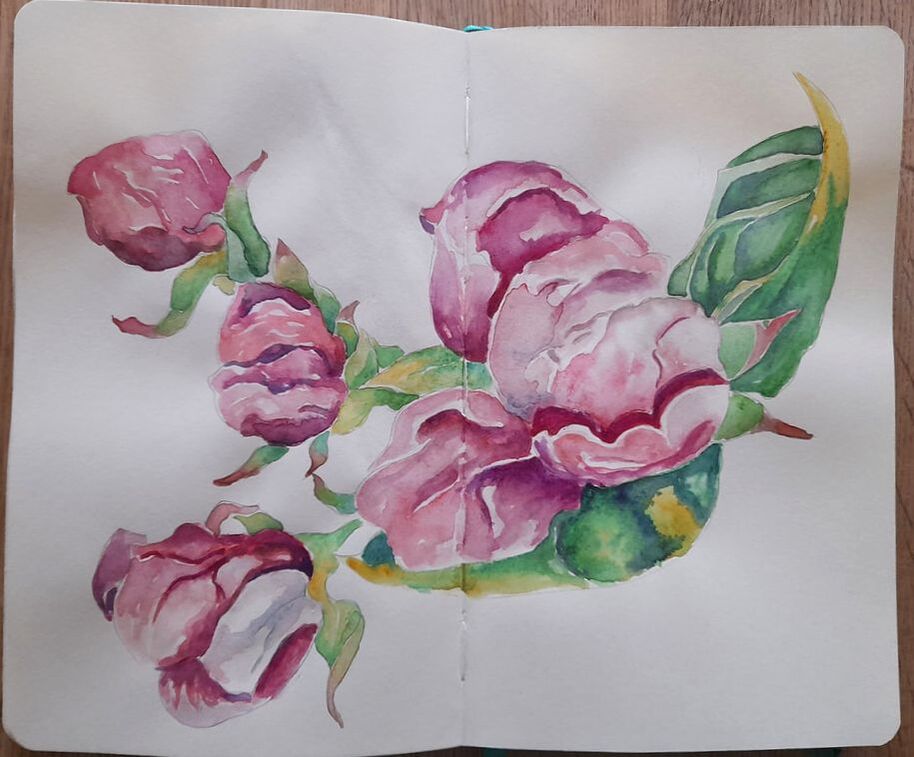 Instead, with our organic ink, I was limited in my palette to yellow, flesh pink, violet and a sepia brown. Trivially I totally lacked any green for the leaves and some actual cadmium red and blue to get purple hues.
Experiments with limited palettes are by the way always exciting, I still remember as I child I challenged myself, to make drawings mixing only three colored pencils, and still attempting a making good lights and shadows. In this case the whole hues were drifted towards a golden warm overall tone, balanced by the colder violet of the blackberries. I find that the result is a more poetic and melancholic effect, leading us to travel in time, from a lively spring to a sadder fall season. The meaning of the painting acquiring a more existential mood, the blossoms in my sketchbook are brutally lively, the blossoms resemble more inner organs (hearts - especially the lower flower) and bleeding contracted faces than flora. In my organic painting, the blossoms have acquired a less meaty quality, they seem more ethereal and weightless, still wrinkled in effort but also floating on air. At the same time, an autumnal mood underpins the whole scene, the golden-brownish leaves on the top right resemble dry autumnal leaves, the blossoms, golden and wrinkled, are expecting to wither and die, even before blooming at full. The different hues also twist the meaning of the wrinkles, even if in both paintings the blossoms are wrinkled, in my sketchbook the pinkish hues suggest a muscular tension hence a lively energy permeating the membranes of the petals, in my organic painting, the golden color suggest dryness, blossoms that are dehydrated, weightless and crumbling, tiny fragile bodies lacking vital force, at the edge of their effort to survive. I hope you like my new attempts, feel free to leave a comment and thanks for stopping by :) XXX Bertie 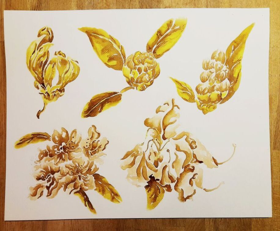 I am back after holidays, finding new courses, an insane amount of things on which I am sickly delayed and my precious project with Spinderihallerne. The project is taking form, thanks also to the ovely and competent Shanice Otersen the coordinator of Spinderihallerne fablab and the directors of the whole facilities. The project has become richer and will include aspects of STEAM integrating botanical art practice and technique, biology with respect to the development of process of plants building on D'Arcy Thompson work on how physical forces act on the development of living organisms, making, and elements of biology and chemistry in relation to the making of organic inks, and even code as the forms in nature have lead to the formulation of geometrical principles and formulas to express the forms of plants, leaves and flowers. So it will part of my research in relation to learning sciences, art, and creative practice. The painting above illustrates the development of rhododendron flowers and it is painted with ink gained from turmeric root, onions and coffee. Here you can see some one of the steps in the making. 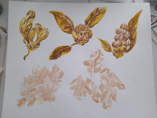 Withering and being born - the above painting is painted with inks from onions and coffee, it is inspired by a withering orchid, it represent an unborn child or a child getting ready to be born, cuddling in petals as if these were blankets and his umbilical cord, slipping away from the scene leading to more to come. 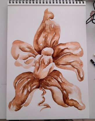
Here is a first attempt made with only coffee.
This painting represents for me the connection between life and death in the natural world. Thank you for stopping by Bertie xxx 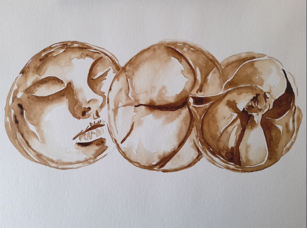 I am happy to share that I am starting a collaboration with Spinderihallerne, an ex-factory for textile production, converted to a centre for art and innovation, located in Vejle, in South-East Jutland, close to Kolding where I will have my new office at The university of Southern Denmark. I will specifically work as a Guest Artist at their Fablab - Biotechlab, where the coordinator, the nice Shanice Otersen, is experimenting with creating materials out of fermentation of bacteria and algae. We have joined forces to create material for an exhibition, in particular naturalistic-botanical watercolor, using organic colors derived from plants and... food ;) Our color will include ink, that Shanice is synthetizing at the Biotechlab from among others: onions, turmeric roots, red cabbages, and beetroot. I am on the other side experimenting with instant coffee, curcuma and cochenille, which I got from a friend. 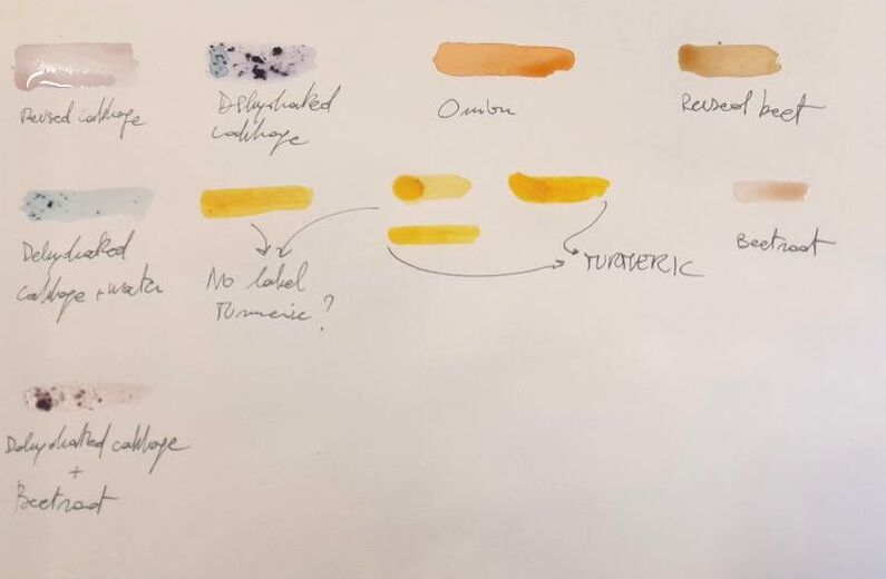 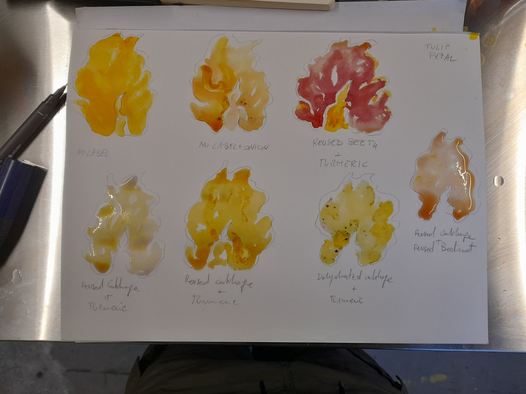 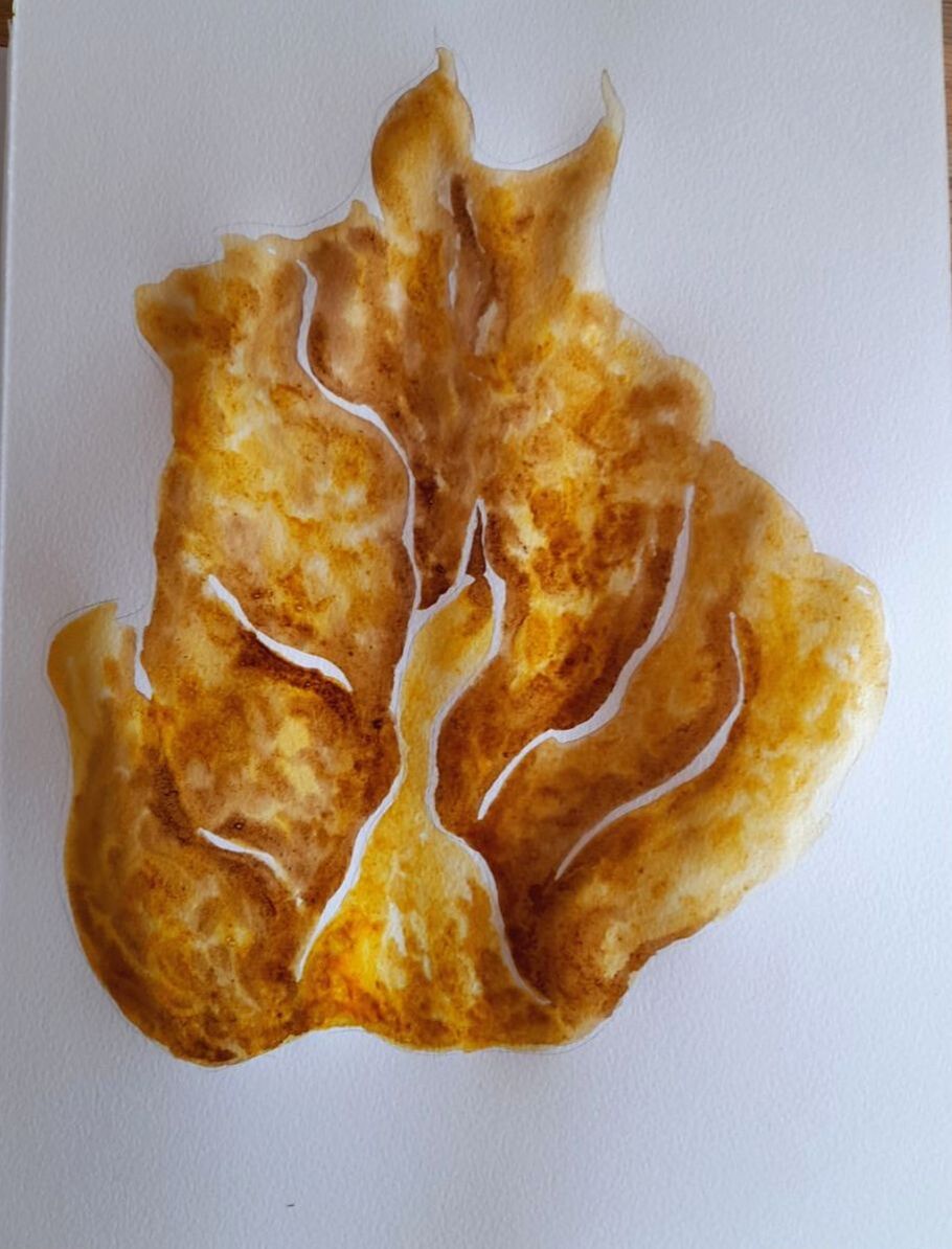 Our art will focus on vegetable-organic life in flux, showing how different organisms from microorganism to macroscopic plants, animals and humans converge towards the same forms as they are affected by the same physical forces and the same biological cycle, determined by bio-chemical transformation, from generation, birth, growth, aging and death. We are all intertwined in the same life cycle, no matter the complexity of the organism and its original form as determined by its DNA. I painted the drawing shown at the top of this page with instant coffee socked in little water, I have represented three different beings: a chlorella cell whose spots resemble the human face we all see in the moon, a lilac blossoms and fetus. All sharing circular forms with spots, wrinkles or bents, showing faces and mouths. In the above paintings, I have experimented with the different colors made by Shanice at the Biotech lab. The subject I have used as test, is a withering tulip petal, which has a interesting form, the anther originates from the petal and seems to resemble a match, but also the body of a swan with a black head. I imagined a swan's song, which I have re-painted with curcuma and coffee. Our art will embody a circularity as we will paint organic life with organic inks. The technical challenges are many. First of all in my paintings I would like to keep a watercolour botanical quality, which means: sensitive shading and details, using water to dilute the ink to get light tints, and a certain degree of precision, trying to work with wet-on-wet and dry-on-wet techniques. Moreover, organic colors might rotten or fade, so I have tried to fix the color with Arabic gum, trying to avoid to dilute the color too much. In the next painting, I have painted the stem of a withering lupine utilizing coffee, curcuma and red cabbage from the Biotechlab. I wanted to capture how the withering stem resembled a spine ending in a reptilian, dragon-like, scaled head. In the following one, I have made a trial with coffee and cochenille, from my friend Sara and it gave a quite interesting effect, as the cochenille give a delicate purple, but when we add more the delicate tint fades into grey-light black and with coffee it gives wonderful warm shadow effects. 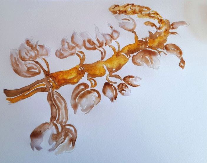 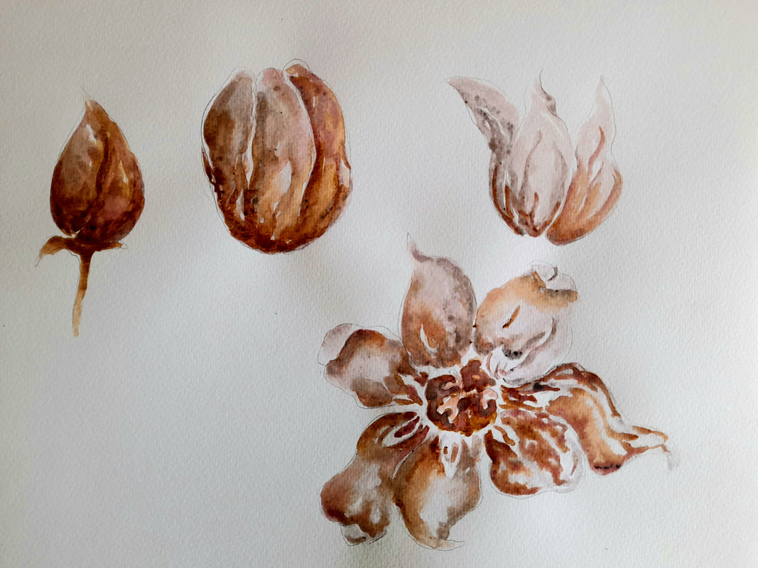 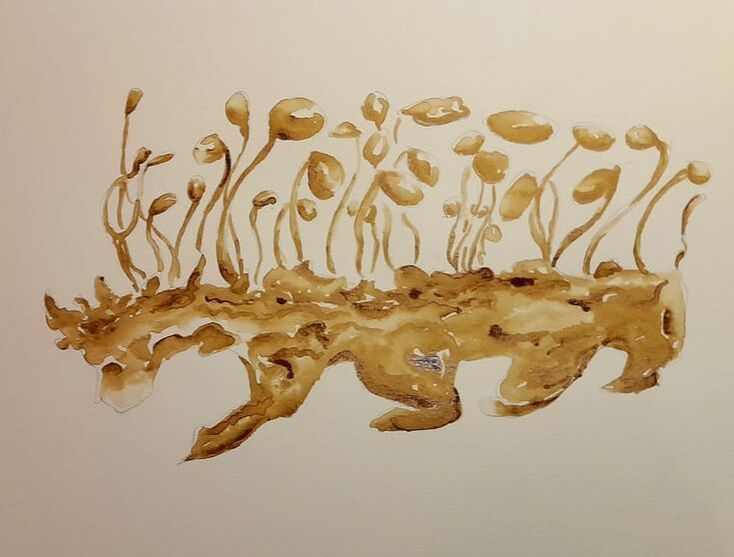 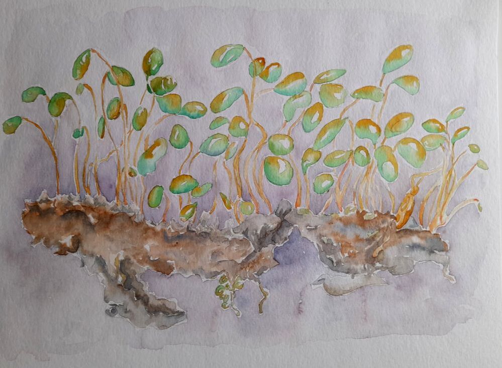 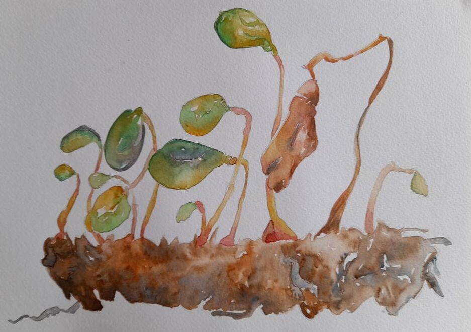 The above paintings represent a moss clod, that I have removed to clean up the tiles in the garden ;)
The top one is painted with coffee, while the others with regular watercolors. I tried to capture the multilayered structure of this tiny moss, looking at the single globular parts as if they were heads of Martian-beings standing on a hunchbacked stem. So, these are initial trials but after summer holidays, I will work further at creating organic subjects with organic colors, mixing with gum and other mordents, trying to prevent the paintings from fading too much. But after all, fading is like withering, and probably my paint will slowly wither as the subjects they represent, microorganisms and plants as made of living flesh. Have a nice summer and thank you for stopping by xxx Bertie 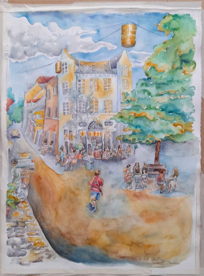 Finally it has arrived, from today 22nd of May 2023, my coffee-themed watercolor paintings will be displayed at Nelle's café Overgade in Odense. This is the largest painting I have made for anyone 76*56, Lykke, the kind manager asked explicitly to make a large piece with their front entrance and we agreed on showing it in summer with customers enjoying the sun with their coffee. I have to say it is not the piece I am most of proud of, but it helped me to push my boundary, I took a lot of time as I did not want to spoil it. I also used high quality material, my kolinsky brushes, Daniel Smith water colors, I think I have used most of the available hues. I tried to suggest the heat of a summer day just after the rain, as it is common in my beloved Denmark, so I combined warm hues, Quinacridone Gold and Burnt Sienna above all, and cold hues Blue Phthalo and Cobalt with hints of Burnt Umber for the greys. I have worked mostly wet-on-wet, and left the hues to bland and embrace each other on the paper, not to lose their individuality. The building itself is kind of white-grey, I tried to make it more interesting adding bluish shadows and golden lights, suggesting the sun being sucked by the building, which donates warmth to the customers, enjoying their time under sun or under the shadow of the big gingko tree outside. I tried to keep faithful to some of the landmark on the road, the old inn with flags, the stone paved road, the trees at the end of the road and the curve. The guy on the front with the red shirt, well, he is basically my husband ;) I wanted a key figure to guide the eye of the viewer towards the entrance, but not quite there, so I started sketching a tall slender guy, wearing a bright coloured shirt, with chestnut brown hair and well there you are, I have painted my hubby and as the figure was taking form, he just asked me if he was him ;) Here you can see the painting on the wall of the café, I will post more details on the paintings. 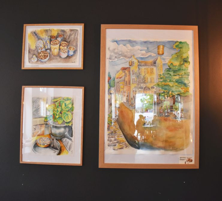 Thank you for stopping by, I gotta get some coffee now ;)
Bertie xxx I started collaborating with Galleri Knægt in Bogense, North of the island of Fyn, last fall, when I was invited to draw live for Sprogense, a festival about language organised by Det danske Sprognævnet, which is the agency following the evolution of the Danish language, a bit like La Crusca in Italy. During the Sprogense festival, Galleri Knægt held a live event with an actress and a musician and three artists, me included, who were supposed to paint following the inspiration we got from the reading of the actress and the music. It was an interesting experience, which I have presented in this blog just after I have participated. I have also to say that the owners of the gallery are two nice men, who were very supportive of my needs for the performance, they offered me and my husband free coffee and they paid a good honorary for painting for 3 hours, when I paint all the time in cafés for free ;) 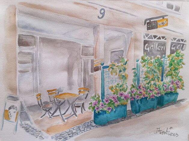 A part from the jokes, it was an amazing poetic experience, but very intense. I had to concentrate on multiple stimuli floating around me all together at the same time; the music of the guitar, the words of the read text, the voice of the actress, who expressed her sensitivity in making the text alive through dramatic pauses, shifts in rhythm and voice pitch. And the text was in Danish, so I had to concentrate more than usual to follow in depth a literary Danish text read through a dramatic interpretation. But I was determined to create a series of expressive paintings, which could look nice and at the same time relate to emotions, rhythm and content.
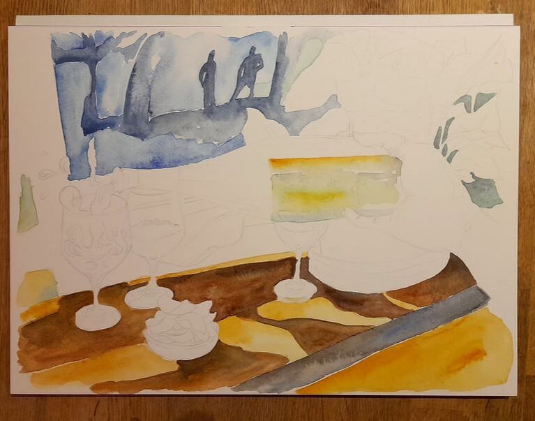
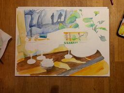
I am glad to say that this time I am invited to paint during a live Jazz evening and it feels like it could be another nice experience. In the meanwhile I will listen to Jazz music to prepare myself to react to it, while looking forward for the event ;) The event will be held at Galleri Knægt in Bogense on the 9th of June at 19:30, here you can find the link to the event: https://galleriknaegt.dk/index.php/kunstforening/ Thank you for stopping by Bertie xxx PS I re-share this post as by mistake I drew the old façade of the gallery, here is a watercolor of the new location :) I wanted to keep doing this blog as it is nice to have this space as a sort of open diary, putting here my paintings step by step and seeing people engaging, even if quietly with my art. Unfortunately I have been disrupted by some bad experiences, I lost my mother in December and since then I have felt as living in a weird muted reality, a soft egg shell, from which I tried to deal with my inner pain and sense of guilt, receiving broken signals from the outside. As I write these words I can see possible paintings unfold. But in spite of everything, there were some rewards as well, my daughter is becoming a good well rounded artist, creating new connections at work, new inspirations and ideas emerging. And it has been a great experience to craft paintings for the local café Nelle's, a nice point of encounter in the city of Odense. An elegant cozy place, with good coffee which also tried to keep the prices down in this time. I did a series of paintings about their coffee, in particular lattes and cappuccinos as the foam is just amazing to look at, it generates organic patterns like the foam of the see, mushrooms, or sponges. And then I was asked by Lykke, a lovely woman who manages the café if I wanted to make at least a piece about wine. Now I am not a big fan of wine, in spite of being Italian, I just like wine as a recipe ingredient, nothing cam beat a meat stew cooked in wine, but I am child-tooth so wine is too bitter and sour for me, it just makes me sad. But I can appreciate the colour nuances of wine, its transparency or opacity and glow. Lykke sent me a possible picture she took at the café and then I came out with this: 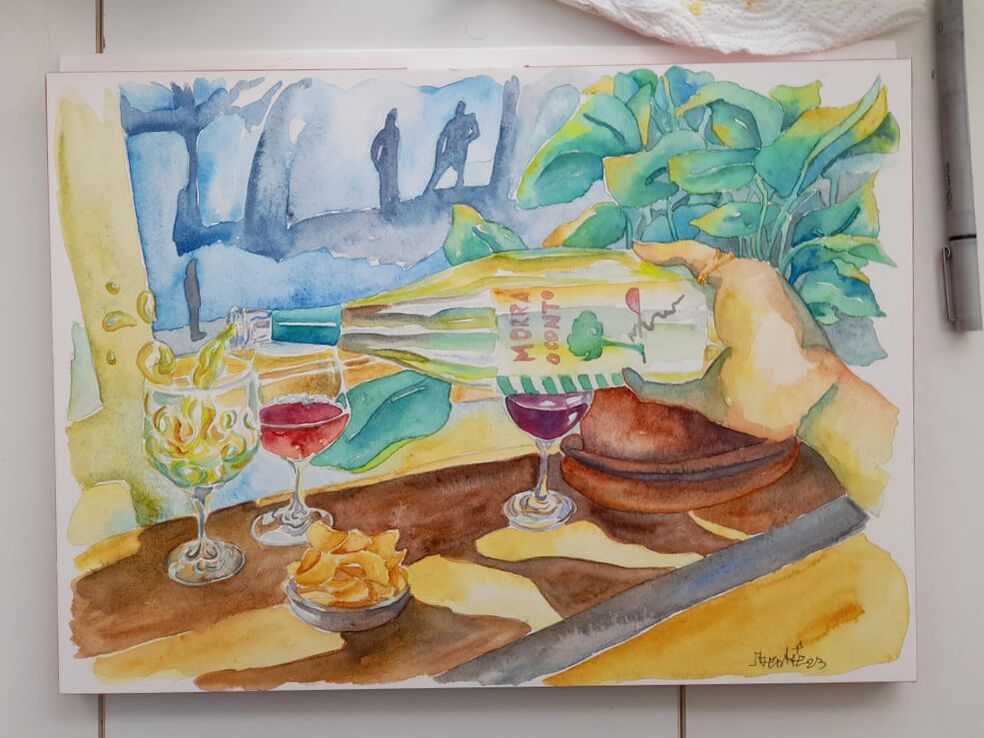 I got a rich picture, with many details and I wanted to create a painting that could be explored, step by step, you see the bubbles being poured by the white wine bottle, the bottle itself with all its rich lights and shadows. Then you follow the line of the bottle and you see a woman's hand, probably Lykke's, pouring the wine and wearing a golden ring on her thumb, in the background a plant with green leaves and under the hand and bottle the plant vase of a terracotta warm colour. Everything is hanging on a window sill, where a little bowl of chips is waiting to be bitten by a guest. Beyond the window, bluish shadows seem to define a background and human figures wondering around and stopping for a chat, life going on outside the café. The never-ending show of life, to which the café offers a moment to rest and reflect, get out from life's ever going rollercoaster and think, eat or drink, while looking around at what happens. No wonder most philosophers chose café to ponder about the meaning of life and everything. Myself I have done my best sketching, reading and writing in cafés, especially while I was studying in Italy, at the University of Torino there were no many spaces where students could hang out and relax or even study, study rooms felt like chickens cages. So in between classes I was often sitting in a café, sipping tea and reading my notes or sketching. Here you can see the stages of the painting, from the initinal stage to end, with company from our cat Khorne and my hubby.
I hope that my painting will contribute to the cozy atmosphere of the café and that you have enjoyed my post
Thank you for stopping by Bertie xxx |
AuthorFreelance illustrator and painter. Archives
May 2023
Categories |
|||||||||||||||||||||||

 RSS Feed
