|
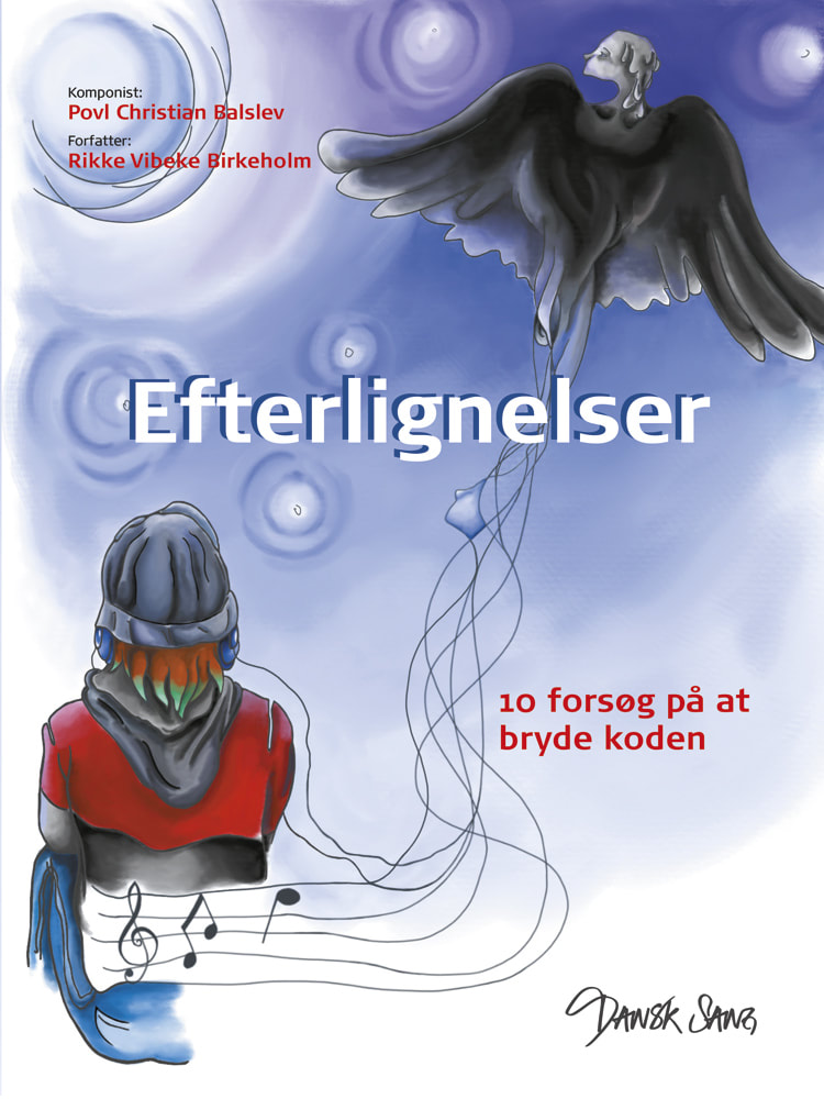
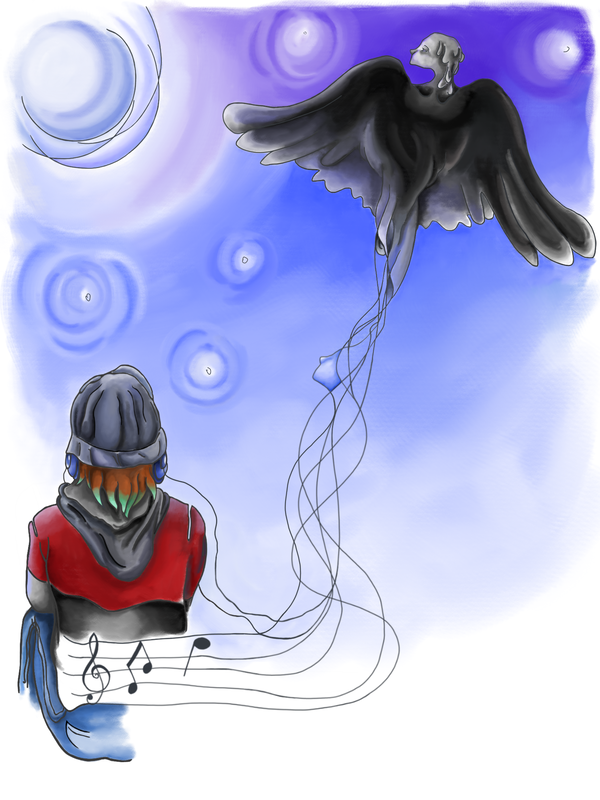
And here I move to my second and last post for today :) I have had the pleasure to work at the creation of 11 digital illustrations for a song book, edited by Dansk Sang. The book proposes a series of 10 songs (lyrics and score) creatively inspired by the parables from the Bible. I must admit I am not religious, but I appreciate how the composer Povl Christian Balslev and the writer Rikke Vibeke Birkeholm, have re-told them in new ways, touching existential perspectives that really are meaningful to young people. The target group is represented by teens, in search of their identity. The texts often explore the theme of multiple roads to choose from, young people facing the challenge of finding their path and eventually their way home. In my drawings I tried to suggest this existential theme, developing a metaphor of crossing lines, streets and perspectives. In the book cover, displayed here, you can see a teenager listening to music seen from behind, so that anybody could identify with that figure. From the headphone cables and the sweater a series of lines depart, forming a musical staff hosting a couple of notes and then crossing each other as the move up towards the sky. The lines then suggest how music start from being written and played through the staff, but then it spreads in the air embracing us and transporting us to another dimension. Music is a dear element in teenager's search for identity, enabling them to construct and express themselves, search for philosophical meditation, embodying a sense of mystery. In my drawing, as the lines move towards the sky, they assume the form of enigmatic figures, a little profile and then a winged black creature, suggesting how teenagers might want to find music that helps them distancing themselves from the positive feelings associated to childhood, embracing more intense emotions, finding room for themselves and facing their own challenges in their own way. This is exemplified also by the dark clothing and partially dyed hair. My goal was to provide a genuine feeling related to that age and its challenge and not an idealised notion of teenage years, as we often see it in the media. This drawing as other illustrations I have made for the book are inspired by my own feelings as a teenager and by my daughter who is now 14, we discussed together different themes for my work and she gave me constructive feedback on what could be improved. In the next weeks, I will be posting my favourite illustrations from the book, which is now for sale on Dansk Sang: https://butik.dansksang.dk/produkt/efterlignelser I hope you will enjoy my illustrations, feedback is always most welcome :)
0 Comments
This is a special day, I have two posts to make. Let's start with the first post, I am very proud of my husband, Andrea Valente Associate Professor at the University of Southern Denmark under the faculty of Engineering, who during this Quarantine time has spent his time writing a good, intelligent, creative and original book about basic mathematics for adults, who like myself were struggling with understanding maths. We are both fascinated by investigating alternative ways to concretise abstract knowledge, so we spend much of our time discussing how to make abstract concepts from maths, sciences, history and social sciences more intuitive through translations into multimodal interactive texts: simulations, interactive examples and diagrams. This is exactly what he did in his book, he presents the basic mathematical operations through illustrations, interactive exercises, and simulations. His book might represent how future textbooks might be, combining texts and interactive visualisations, enabling for a more dynamic and fun fruition of knowledge. I had the privilege of drawing a digital illustration for his book cover and I am in the process of adding a couple more simple illustrations. You can see the original drawing for the cover in this post. For the cover I have chosen a minimalistic style inspired by comic books, as the book itself aims at values like simplicity, informality and humour. I have opted for thick lines, mainly black and while with a hint of desaturated colours, highlighting the darker areas of the objects represented. We discussed together which objects to represent in the illustration and we have included: 1. Cubes - to communicate simplicity and playfulness to point at the informal tone of the book and the simplicity of the exercises proposed. Our reference are the cubes displaying numbers and operations that children might use to play and start learning maths since kindergarten. 2. A cup of hot coffee - to communicate that maths is approached in an informal and relaxed way and also that our target group is represented by adults. 3. A pair of glasses - to communicate again that that our target group is represented by adults and to suggest that even though the book content is playful, yet it is not taken in a superficial way, so it might require some focus and concentration. All together it has been a fun work, where the challenge was not on the technical drawing side, but on conveying the complex meaning embodied in the book through a simple minimalistic style. The book is available for free online, see the link at the end of my post, and I hope that many of you might have a look and enjoy it :) http://andval.net/FGMbook/ 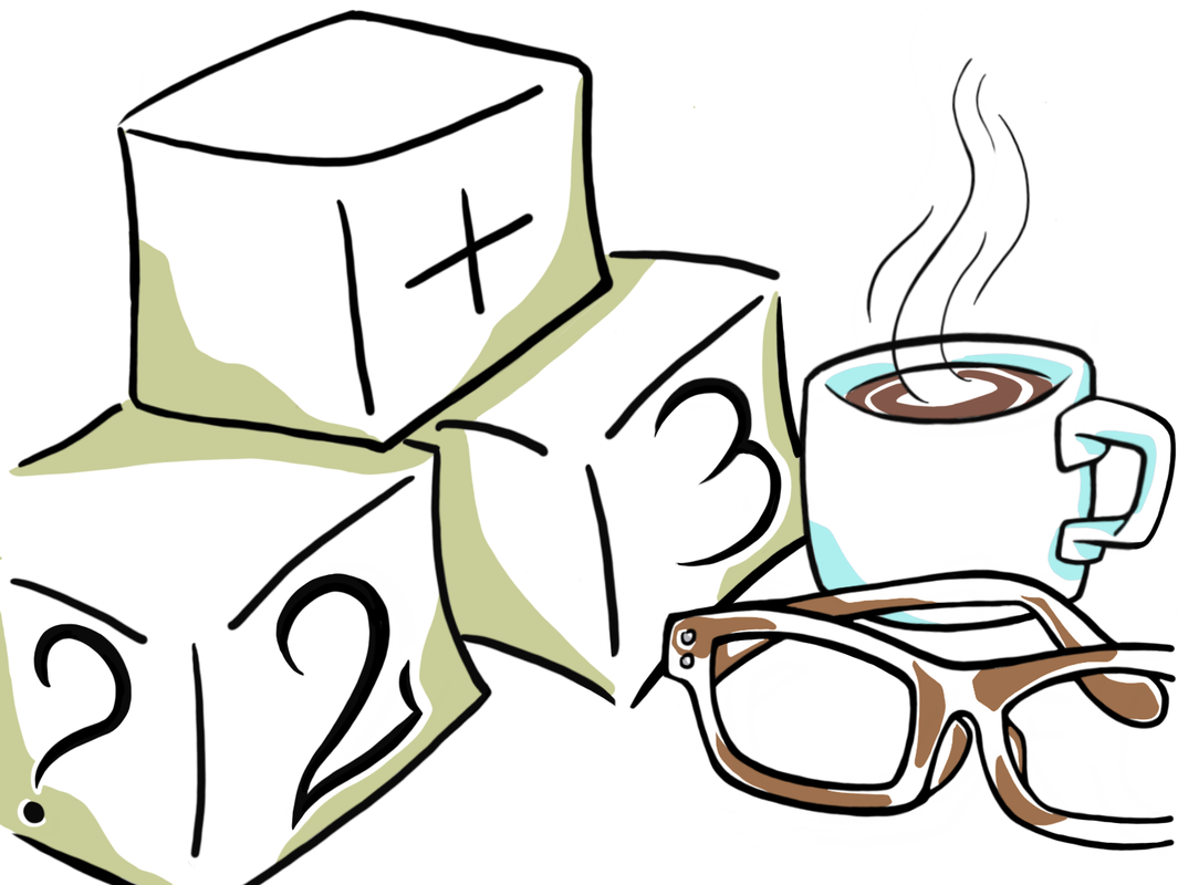 Dear Visitors, I am happy to welcome you to my new art blog :) As you can see, my website is under construction and sketchy, I will soon edit my upload better quality images. Therefore, today I decided to give the spotlight to this urban sketch which is part of my always present art journal. It is a simple sketch, drawn with a mixed set of markers. The first set are twin markers, with a thin and a thick tip at the opposite side of the marker, from the brand Monami and I bought them in November in an art supplies store in the center of Taipei, in Taiwan. The second set is from the brand Monday Sunday and I bought them in Aarhus, Denmark. Monday Sunday is not really an art supplies brand, but they were cheap and surprisingly pretty good. The Monday Sunday markers have thinner tips than the Taiwanese twin markers and can bend almost as brushes. I made this sketch one morning while my husband, yes, that guy in the blue jumper sitting in front of me and sharing coffee with me, and I went strolling in the lovely town of Svendborg, Denmark, and we stopped for breakfast in a little cafè called Knæwr, quite hard to say I must admit, but a lovely place indeed ;) Now this quick sketch, of which I was not particularly proud, it is quite messy, like my website now, has become particularly dear to me. For some reasons, it got many likes on my Instagram and on Facebook, but most of all, it remained a sweet memory of the time just before the Covid-19 pandemic exploded. This sketch combines in its materiality inks from two opposite sides of the world, Nordic Denmark and Southern Asian Taiwan, a lovely and lively place to be. It also reminds me of the lovely time spent with my husband strolling around, sharing coffee, and enjoying life in its spontaneity, flowing naturally and "messily" like the ink from my markers, without a clear plan. But now it is time to clean up, prepare to get out again, and plan the making of new and improved urban sketches :) All the Best Bertie-Emma 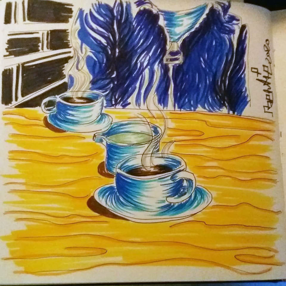 |
AuthorFreelance illustrator and painter. Archives
May 2023
Categories |
 RSS Feed
