|
Mid March and still the temperature is low, today is snowing again :( It feels as if spring is struggling to bloom against a cold that does want to leave. At the same time I have had a chance to look at nature blooming in my garden and in the city parks, even if wrapped in ice. 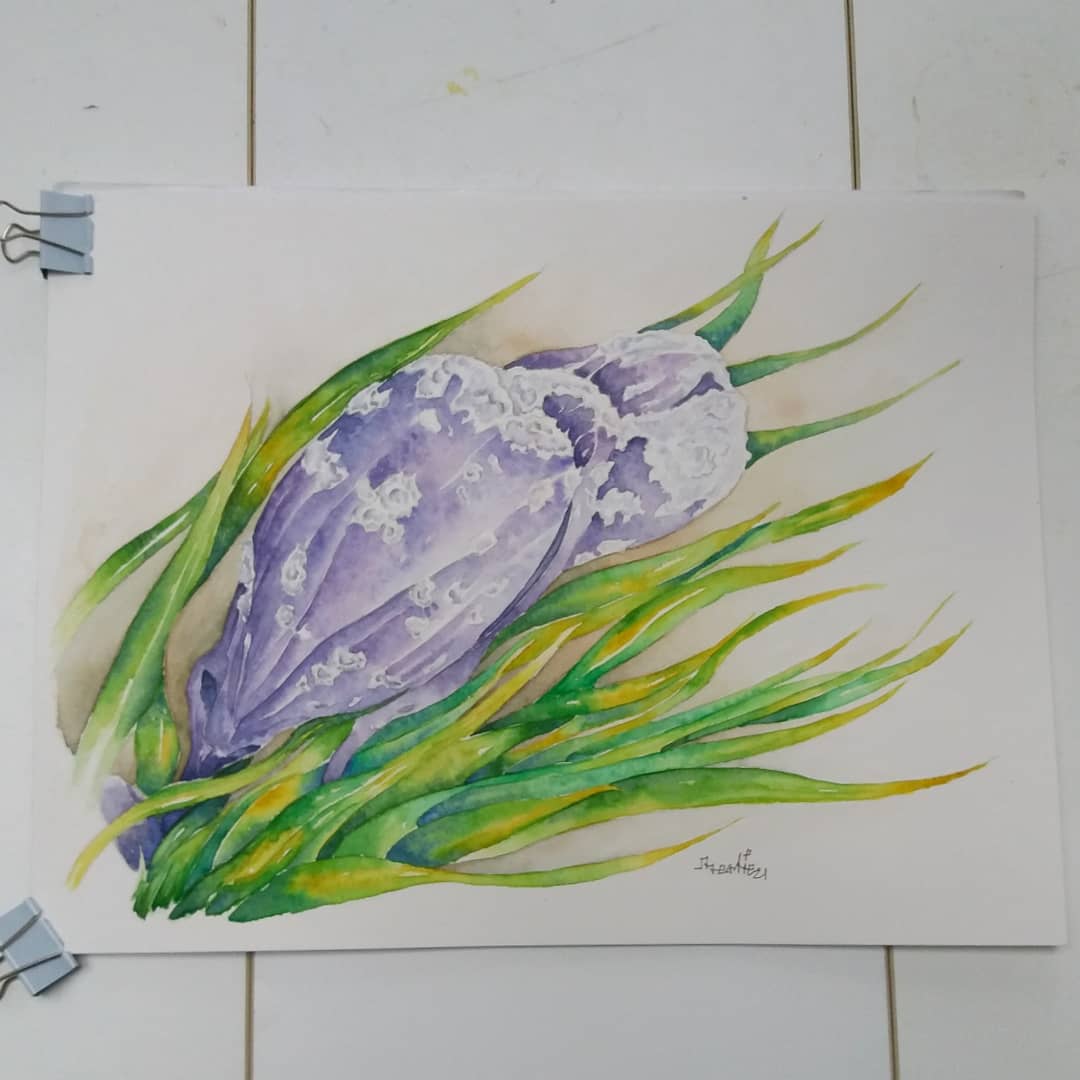 I was struck by these two fellows here in my garden, two violet-blue krokus. By the way, this is my favourite color for krokus and one of my favourite colors in general. These two apparently delicate flower showed a sort of resilience in holding there, but also incredible beauty. I see them as struggling creatures, encrusted by ice, a little blossom keeping up with them on the side, almost drowning in grass. The flowers appear as if opening their mouths, in an effort to either escape or breath. The ice encrusting and the pose the flowers suggest, probably also affected by the wind currents, made me think of two fish or even better whales, racing across the waves, their skin encrusted with sea shells. Starting from this inspiration, I wanted to make a painting that could suggest the gentle beauty of these flowers, but also their powerful struggle to bloom and make it through this cold spring. Therefore, I tried to make them look as if they were moving and to give them dramatic contrast with the paint. I tried to suggest a sense of moving, through the wavy lines of the grass, as if the leaves were seaweeds moved by the ocean waves. The flowers have instead a more solid form, oval and round, suggesting the shape of a fish and also less willowy than the leaves. I also tried to build contrast in between the leaves and the flowers, green and violet, I wanted to make the leaves of a bright but sandy green mixing layers of emerald and olive green for the middle tones and underlayer, cobalt blue for the dark tones and yellow gamboge and quinacridone gold for the light tones. Yellow is complementary to violet the dominant color of the flowers, and also yellow communicates a warm pleasant feeling, so I wanted to suggest that the leaves were thriving, opposite to the flowers, who are instead struggling. The violet of the flowers were gained mixing mainly cobalt blue and alizarin crimson, plus some ultramarine blue and cool grey for the dark tones. Underneath you can see the picture of the original subjects, thank you for stopping by and enjoy your weekend, hopefully a sunny one :) Bertie 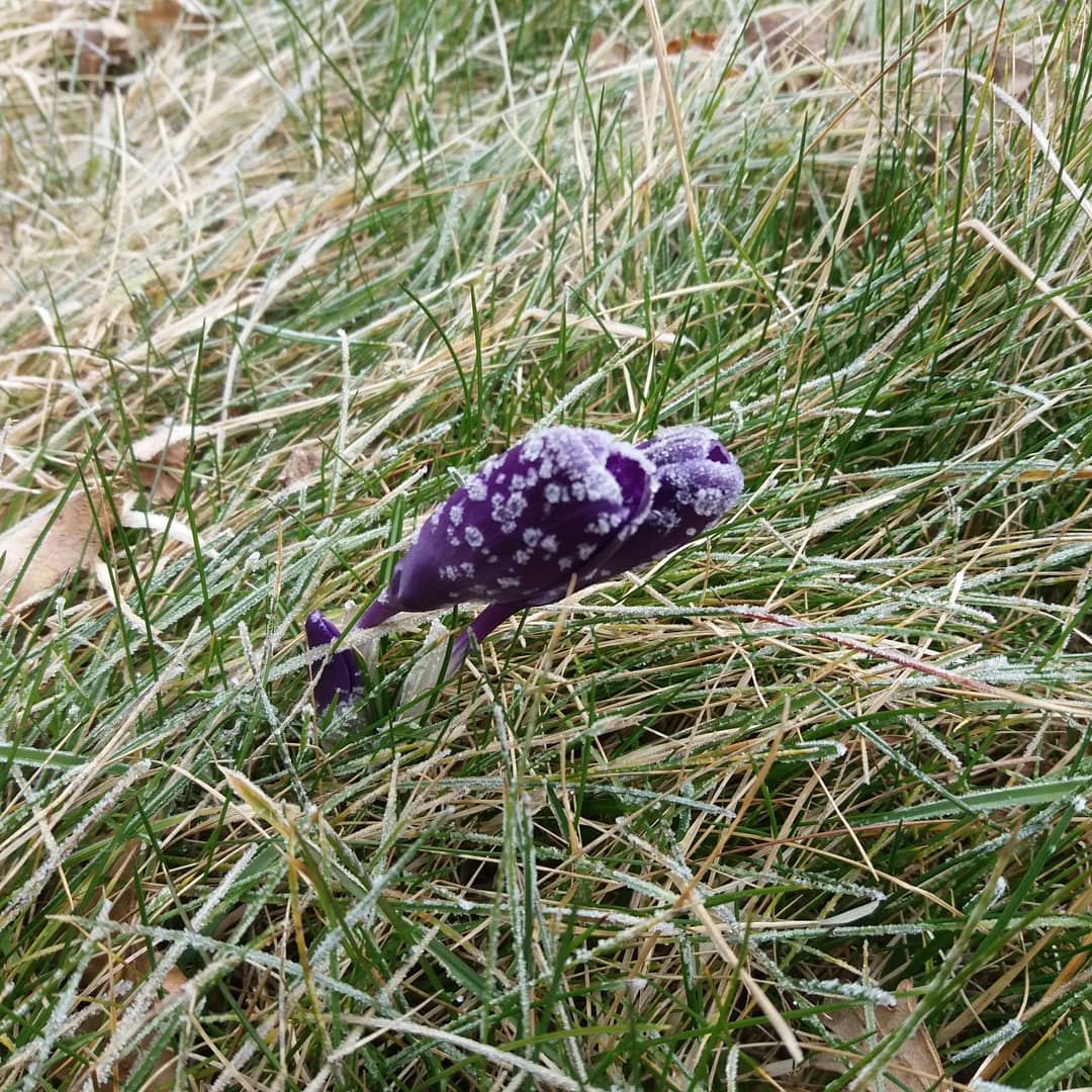
0 Comments
As I said many times: I hate Women's Day! We should not need it, it is silly and it seems there to remind us that women are a sort of endangered species! Anyway, a year ago I made this little piece, I am not sure how, I was inspired by how Mimosa flowers look like small suns or burning fires, so I tought it could be a good metaphor. I also tried to express my emotional state when it comes to these dates and how in Italy it was all flirty and silly, with men giving mimosas around and maybe being jerks any other day ;) 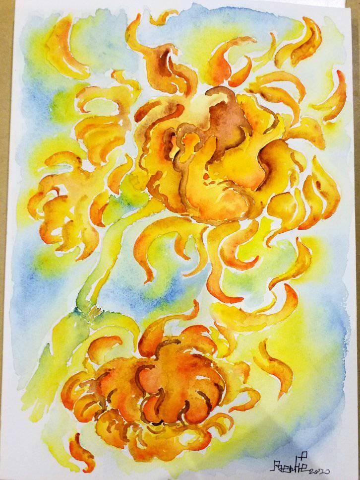 I hope we will soon see the day in which we will all laugh at Women's Day, as a relic of a dark past ;)
Happy Women's day to all Bertie In this awkward time of working online, I have been extremely busy: meetings, teaching, presentations etc. I almost didn't realize 2021 has started, then I passed February, with whom I have a conflictual relationship. February is like those new dishes you try, as soon as you taste it and you are kind of getting used to it, it is all over in a swift ;) I went through my birthday and then I still didn't register we were in a new month, what can I say? So here is my March painting, which I call Digital Ecology. I have shown this a few times, I have made two versions and I think I would like to work further on this theme. 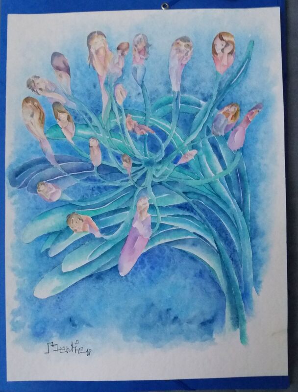 Digital Ecology was inspired by Agapanthus, a lovely exotic plant with beautiful purple, violet or white flowers grouped in bunches. I find this plant very elegant and I love its vibrant fresh colors. I started thinking about how the flowers look like small beings interconnected to each other, a bit like people. At the same time I was doing my usual research on technology mediated interaction and our research group was called Digital Ecologies and I started working more with this theories. Therefore, it became natural to think about how we people are interconnected by our technologies, like the agapanthus flowers are interconnected by their stems.
During the Corona-lockdown time, this painting acquired a slightly different meaning, as our technologies became the only way we could be connected. In alternative we could entertain social relationships within small groups of people. So this piece has come to represent a metaphor of our lives in lockdown time: socializing, working, teaching and learning through digital technologies, interconnected by screens, physical and virtual cables. I have recently made a new black and white version for a friend to be included in a collection of poems-haiku, which we hope to publish at some point :) As I always allow to tell to myself to keep an hopeful open mind: Let's see ;) Stay Safe Bertie |
AuthorFreelance illustrator and painter. Archives
May 2023
Categories |
 RSS Feed
