|
As I have grown an interest for looking into blooming and decay in nature, a few years ago I started to paint a series on the fall season, which I called Golden Fall. The name Golden Fall was supposed to evoke the falling of golden leaves from trees, as if creating a golden waterfall, and the rich and warm colors of the autumn seasons. On the painting side, I started exploring yellows: in particular I fell in love, we can really say that ;) with: Yellow Gamboge, Quinacridone Gold, Burnt Sienna, and Burnt Umber. I tried these colors in different brands: Windsor and Newton, but also Schminke and Sennelier, and have become since the past 3-4 years a constant presence in my palette.  Here you can see a portrait of my daughter from 2019 as a fall fairy and then a bowl full of hazelnuts that we have collected from the garden. As you can see from the golden tones in the paintings, Gamboge Yellow and Quinacridone Gold provide the main basis for the light and middle tones. Burnt Sienna, Burnt Umber provides the main tones for the drak middles tones and the dark tones - shadows. Blue Phthalo and Cobalt Blue enhanced the shadows adding a complementary, cold component to the paintings, contrasting the dominant warm yellow tones, hence making the paintings more lively.  This fall my husband and I got into observing mushrooms in the park area around our home and in town and we found some interesting ones. I took pictures and I am now painting them, one step at a time. I was fascinated by the forms and nuances of those mushrooms, the main challenge was to color them when they are so white. But looking closer, it is possible to see different nuances of delicate greys, soft light browns and whites, which by the way, none of them are really white. The first ones are bell shaped mushrooms. The surface of their hat is soft and smooth, but kind of "feathered", small pieces hang out as if their were feathers and have greyish-golden nuances in the areas where they are drying and basically dying. I recently saw a video on "Kintsugi", the Japanese art of repairing broken ceramics with gold. Looking at the golden ending of these mushrooms they looked to me as the tired wings of old birds, which have been embellished with gold or whose feathers are turning gold out of their flying experience. So I focused my painting in rendering the nuances of these tiny feathers, mixing Van Dyke Brown and Cobalt Blue for the greyish tones, at times a bit of Burnt Sienna, Yellow Gamboge, Natural Sienna and Quinacridone Gold for the godel bits of those feathers. I painted in a wet-in-wet fashion, trying to leave the color spreading itself from the dark to the light tones, I used a cold pressed paper with a light texture to get a smooth effect. I did not paint the ground as friends on Instagram advised me not to do it. In this way 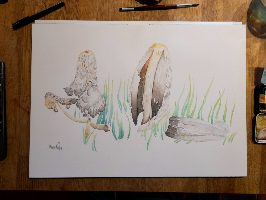 These mushrooms are bit peculiar, I have never seen them before, but many of them have grown around our house. They are pearly white and have a sculptural form, with texture that might recall white marble. I tried to emphasise the nuances to give them more contrast, to make their texture and their many folds visible. I tried to stay true to the pictures I took, but I have also tried to represent them as sorts of birds. The geometrical and imposing mass of the mushrooms make them look like a Metaphysical work by DeChirico or a squared creature by the hands of a Cubist. The paper I have used here is a Torchon Watercolor paper, which means that it is cold pressed and with a heavy rough texture, as I felt that it might contribute to the sculptural forms of the mushrooms. My palette was basically the same as before, but with significantly more Cobalt Blue for the shadows. I painted the ground of this one as I wanted to ground more these geometrical shape, while I left the previous round mushrooms without a ground as I wanted them to appear as floating on the paper. I hope you enjoy my seasonal paintings, thanks for passing by Bertie :) 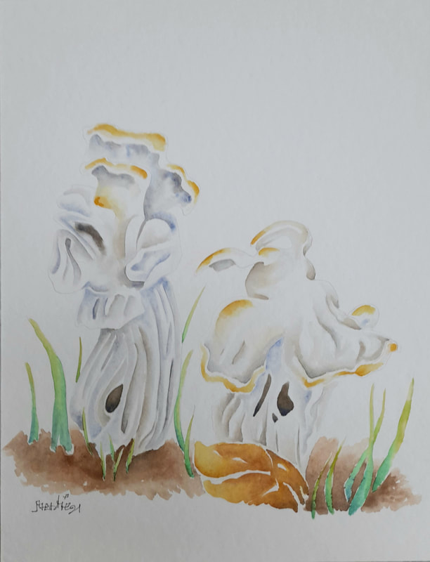
0 Comments
I have finally finished a series of work tasks and I can't wait to enjoy our fall break in Denmark. It was traditionally called the Potato Week, because in the old days children stayed home to help their parent picking up potatoes from the field. Luckily the holiday was kept even if children nowadays do not help their parents with potatoes anymore, but can enjoy time with their grand-parents, friends and siblings. This year my daughter is attending a college and she will be home for the week and I cannot be happier. Fall holiday means: more time to draw and paint, also with my daughter and enjoy long walks with the love of my life, who patiently listens to my delirium ;) I have concentrated my effort in investigating more in depth naturals forms through spring, summer and end of summer. I realized that I am trying to reinvent botanical illustration, showing natural forms, but also draw from imagination and try to reproduce how natural forms end up converging and merging into each other, in an echo of amazing patterns, wrinkles, and volumes. I would like to post here a summary of my attempt at botanical tables, showing the life cycle of canine roses or dog roses e rhododendrons/azaleas. I took a series of pictures and sketches in situ, in the best urban sketching tradition, the locations were mainly the beach Ajstrup Strand south of Aarhus and the Japanese Gardens south of Odense. Bushes of wild canine roses grow up along the beach Ajstrup and are simply amazing, wild and savagely graceful. I was struck about how the leaves and little purple blossoms were torn by the wind, as if they were performing a survival dance, like the historical "serpentine dances" performed by Loie Fuller during the Belle Epoque in Paris. 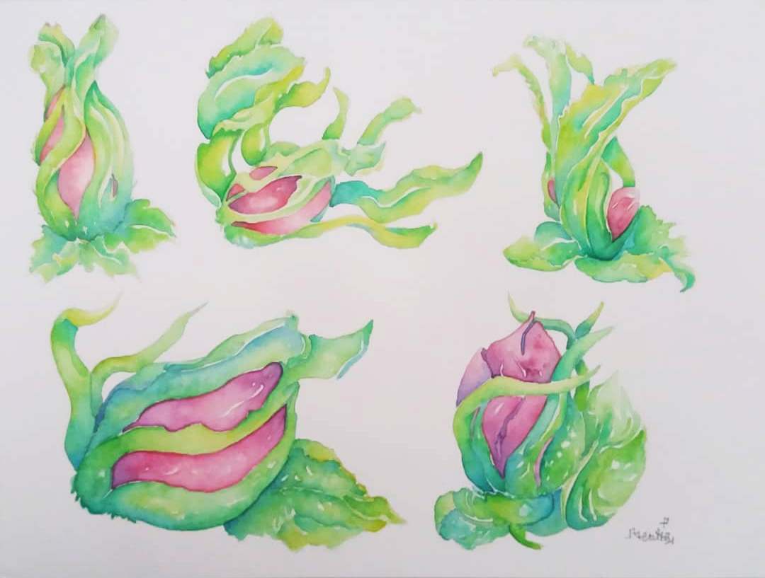 In the meanwhile azaleas were also blooming and I was struck by the grace of their dying dance. I had the opportunity to visit several times the Japanese Gardens, where I took tones of pictures of the many bushes of azaleas. The forms of their initial gems (first-top row in the picture below) were like reptilians in shape and colors, they had a wild and aggressive appeal, they were there to stay fighting for survival. My eyes saw green lizards, salamanders, and frogs, nested on the wooden branch on their bush, eyes closed wrinkled creatures. As they moved towards blooming (second-mid row), the blossoms started to show their rich colors, many shades and tints. The colours looked vivid and strong in the start, they showed an insect-like nature, wings of butterflies eager to open up to the coming sun. When they finally opened up, the petals revealed a more graceful and delicate nuances, like many ballerinas very tutu-skirts the curved stems aimed high to the sun in the sky. As they started withering in the late summer (third-bottom row) they appeared heavy and exhausted, the ballerina could not dance anymore and their skirts did not waved light in the air as before. Warmer shades of yellow and burnt sienna appeared on the rims of the petals: the ballerinas got burnt out by their dance. the petalas hung heavy and more wrinkled, converging again towards animal forms like those of insects or even elephants, as their stems kept pointing up as if their were trunks of elephants trying to resist to their death. I have showed this painting to the exhibition at Filosoffen and one lady paid me the best compliment: "It is really beautiful! I think from now on I will try look more carefully at my bushes of azaleas in my garden, thank you!" 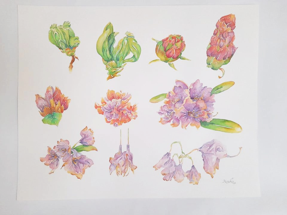 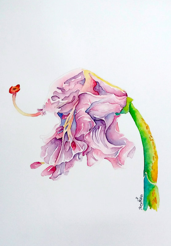 In the above paintings, I focused on capturing the life cycle of these pink azaleas, which I have photographed through my multiple visits. Finally I have tried to paint from a pictures taken in August, in which the flowers are at different stages of withering. Some of them looked like the elephant I have painted above, others looked more like exhausted insects, with multiple legs of antennas, hanging in the air trying to grasp on something to make it. The physicality of these delicate flowers and their bright colors exemplify a struggle in between life and death as they reach their pick and the end of their season. It is in their death that they give us their more dramatic and beautiful forms. 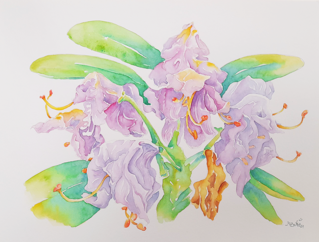 Thank you for stopping by and enjoy your fall seasons
Best Bertie The past years have been exhausting, so that I have postponed the projects that I found more challenging. Recently I had some challenging days, but at least they were exciting :) The exhibition at the Filosoffen art space in Odense went better than expected and I sold two pieces, enough for paying for the frames and art materials. At the same time, I started teaching two courses and writing, I submitted and finalised 4 papers at the same time. All together it is going pretty well, but I have been neglecting my art a bit, and now I feel like I want to go on with my project "No small roles" in which I paint the portraits of exciting women I know, who are making big things in their life. This time I want to show a portrait of my friend Paola Cerutti, who is a pediatrician and writer based in Pavia, in the north of Italy. I have met Paola during my first year in highschool, it was a horrible year for me, I had issues with my family and school as well. We were quite opposite, she was pretty and in control, good at everything! I was a mess... We both shared a passion for art, we both had interests in dance, theatre, writing and drawing. She was friendly and helpful and even if I failed school that year, she was always a good supportive friend. We still kept in touch, even studying at different universities and in different cities. The evening before I was supposed to meet the guy who is now my husband on a blind date, we went out for the night and we were making fun on my imminent blind date. This means that it was on the 20th of July in 1999. Towards the end of our night out, we imagined how ugly or weird my date could be, I remember even saying: "I hope it is not one of those bumpkins with blond dyed hair!" We laughed a lot! Surprise, surprise, the day after my date had actually had blond dyed hair, I could not help but laughing, but he was also cute and here we are... At that time we were both at university, she was studying study medicine, she specialised in pediatrics, travelled different places. Fast forward to nowadays, she is a happy doctor, happily married with two daughters, and she has so far published two funny but informative books about maternity "Come una mamma" (Eng: As a mum) and "Neonato: Istruzioni per l'uso" (Eng: Newborn baby: Using Instructions) about how to take care of newborn babies. I had the privilege of providing a watercolor painting for the front cover, which I have painted while I was pregnant with my daughter. Her books became rapidly popular in Italy, of course, because when she does something, she does not spare herself, she does it well! ;) One day she told me: "Can you make me as an cartoon character?" It is not my usual art style, but I work with animation and character design in my research and teaching, so I thought: "Why not?" Here is the result! 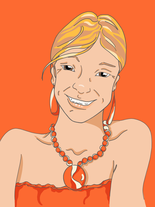 Paola is a warm, passionate and exuberant woman, she has always been. We are quite opposite, she is very sociable, open to meet new people all the time, while I would just crawl into my dark cave. She is solar and colourful, she has always loved warm colours. She gave me a series of pictures and I have chosen one where she is wearing an orange dress, earrings and a large necklace. Process I decided to make orange the thematic colour of this digital illustration. I worked from the picture with my tablet and stylus. I tried first to capture her expression, her witty smile and smart, half closed eyes. I drew the lines in a dark warm grey and I made a palette of warm colours: peachy beige for her complexion, orange, dark read and sand yellow for her dress and accessories. I started painting with the main light tones with the ink tool, to achieve a flat colour effect on my tablet. Afterwards I tried out a few beiges and reds, then I gradually selected the dark shades I wanted to have for the shadows, to have a good contrast but not to much. To communicate her personality the portrait had to be bright and not to dark and dull. At the same time, I did not want fully saturated colours, it would have made the portrait childish and not elegant, she is an adult intelligent woman, a dreamer but also concrete and I wanted to communicate that. So I selected moderately unsaturated earthly colours. I used oranges on her jewellery as well as on the background, as I felt it gave the portrait a bright monochromatic appeal. I can see that I have a lot of work to do to make good cartoon-style portrait, but why not giving it a try? Thank you Paola for giving me a chance to explore new territory and keeping me on guard ;) Thank you for stopping by, Bertie |
AuthorFreelance illustrator and painter. Archives
May 2023
Categories |
 RSS Feed
