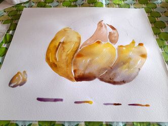
 Experimenting further with organic inks together with my friend Shanice from the Biotech lab at Spinderihallerne, she inspired to try further in making inks. There are huge blackberry bushes just behind my house, some are good to eat, most of them are not ;) So having browsed among different recipes online and having taken pictures on my phone, of Shanice's recipes, I tried to experiment more. So I went to pluck a bowl of blackberries and I started making ink. I have boiled the berries, sieved them, added Arabic gum, salt, white vinegar and alum dissolved in boiling water. These substances should secure that the colors will no fade to sunlight or over time, and the vinegar is supposed to avoid the formation of bacteria and prevent the pigments to rot, being vegetable based it is a risk. I poured everything in a clean jar and I was ready to paint :) 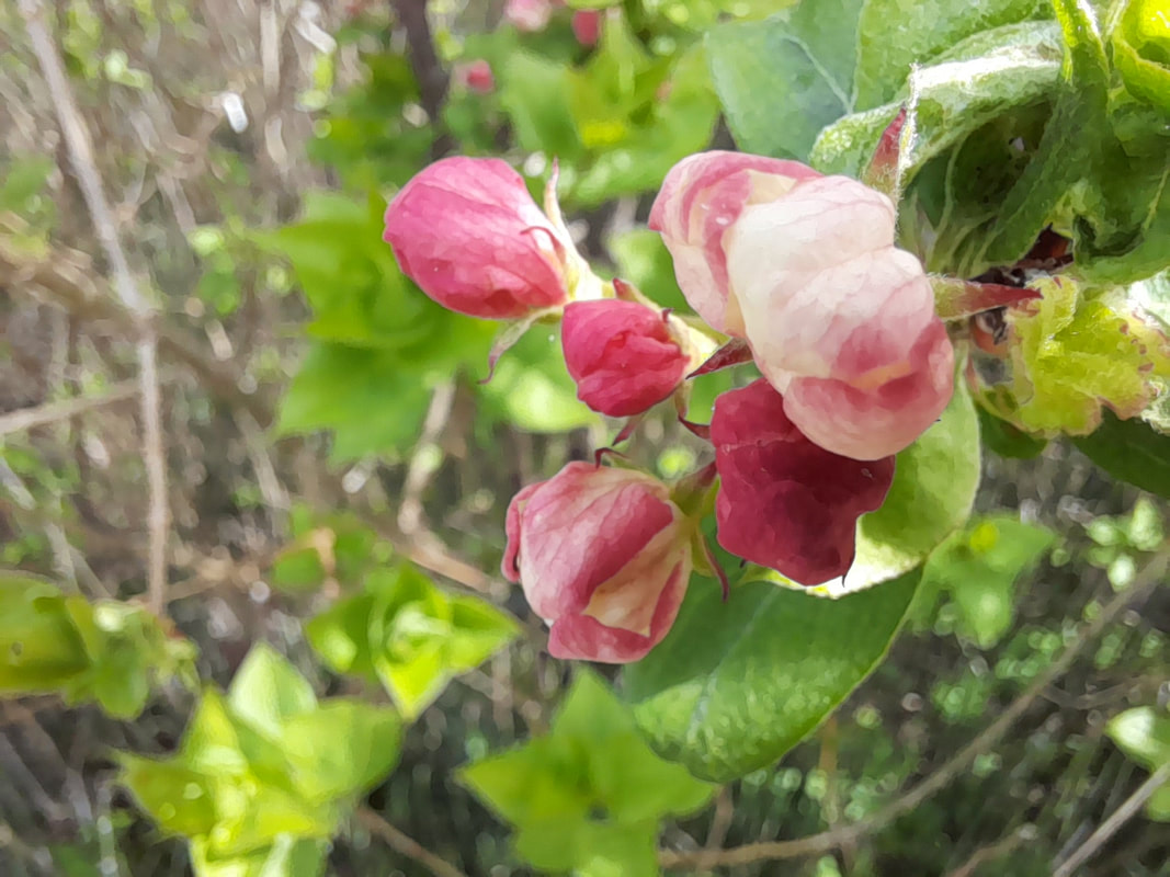
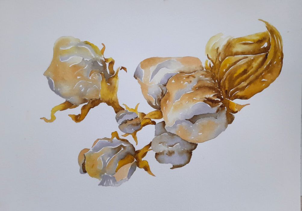
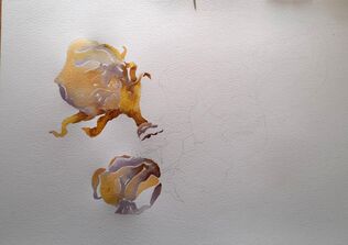
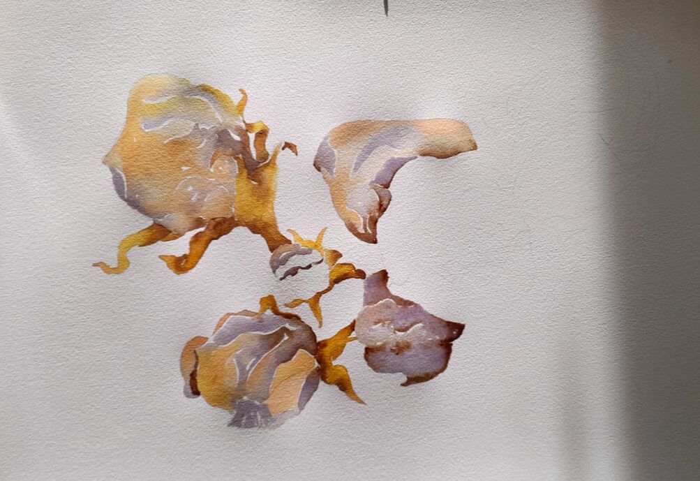
In this painting I have experimented with this picture you can see above, which I took of the apple blossoms that were growing on the apple tree in our garden. I focused on the way each line and curve, and their change in direction inspired me, forgetting that I was drawing flowers. The forms of the apple blossoms to me recall the forms of contracted round faces, their wrinkles drawing pointy curves of closed eyes and mouths. I see these blossoms as small newly born organisms, contracted in the effort of surviving, eager to develop and feed themselves with sunlight and rain. I used from Shanice her pink onion ink and her bright yellow turmeric ink, the paste pigment I gained from coffee, and the new ink I made from blackberries, which looked like a liquid dark warm purple, but when painting it turns into a colder blueish violet. It might even turn to dark grey, when applying many layers on top of each other. You can see above two images from intermediate stages of painting the apple blossoms. And down here you can see the blackberry ink in the making. 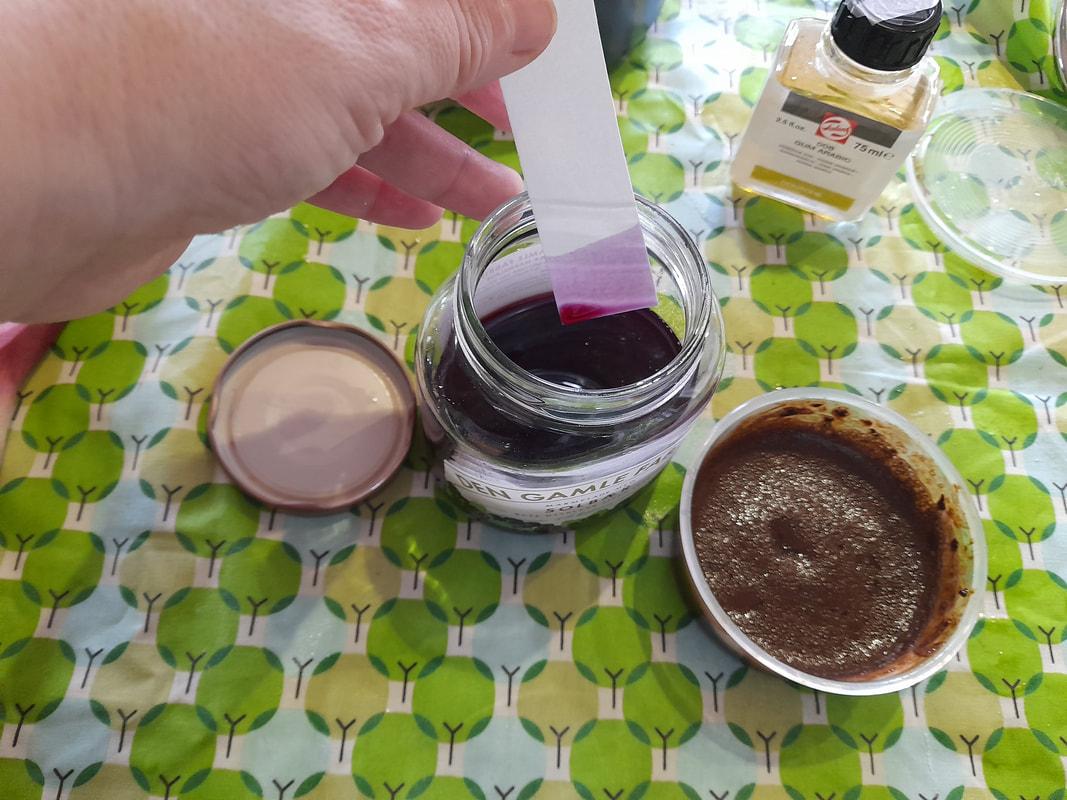 As you can see, in the test paper freshly dipped into the ink, the hue is of a worm pinkish purple, but when it dries it turns a blueish violet, probably because of oxidization of the pigment. You can see the changes also here in these test sketches I made, where I also tried to mix it with other pigment.
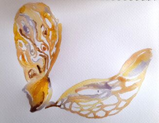
In the image above on the left you can see the blackberry ink mixed with the yellow turmeric and the pinkish onion, which can be an excellent hue for flesh colors. Turmeric yellow is extremely staining, you can see the yellow stain in the bottom round shape of the drawing on the right, which is supposed to represent a helicopter seed, transfigured into the carved wings of a dragonfly. As you can see, in the round junction of the wings, there is a thick, opaque stain of yellow. This stain is produced by the turmeric yellow ink, when applied on the paper, either pure or when the water on the page is almost dry or definitely wet on dry. The best way to control turmeric yellow and how it spreads on water, is to premix it with water or with another ink, in my case I have premixed a drop of turmeric with a drop of water, or with onion ink, which has a delicate hue, when I want to have a darker hue with coffee, and then I start applying it on a light wet water in the areas I want to be darker, and then I apply pure yellow close by where I want a lighter area. All together our color wheel gave an iridescent effect, in the way the cold violet and the warm golden hues from onions and turmeric blended together on the paper. I simply loved it :) While violet and gold are almost in a complementary relationship, as the violet/purple and yellow are in fact opposite in the color wheel, with purple being composed of blue and red and together with yellow, these hues complement the series of primaries and associated at the same level of darkness and saturation they give a maximum level contrast, which could disturb your eyes. In the case of my painting, being the pigments organic, they are not stable enough to have maximum saturation as you would gain with chemical colors, therefore, these hues naturally blend with each other, giving a visible but harmonic contrast. Of course, the main challenge I had to overcome was the difference in hues, between the flowers in the pictures and the inks I had available. Using the pigments we have made, I could not have pigments to exactly match the hues of the blossoms, which are in the spectrum between a warm white and a lively warm pink and purple. Here you can see a sketch I made on my sketchbook using regular watercolors, and colors that more realistically match the actual colors of the flowers. 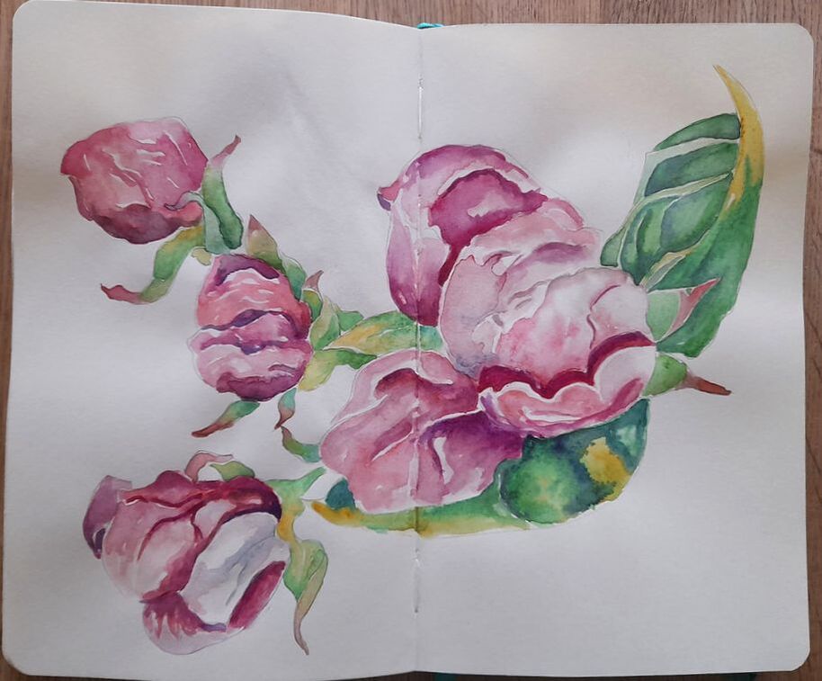 Instead, with our organic ink, I was limited in my palette to yellow, flesh pink, violet and a sepia brown. Trivially I totally lacked any green for the leaves and some actual cadmium red and blue to get purple hues.
Experiments with limited palettes are by the way always exciting, I still remember as I child I challenged myself, to make drawings mixing only three colored pencils, and still attempting a making good lights and shadows. In this case the whole hues were drifted towards a golden warm overall tone, balanced by the colder violet of the blackberries. I find that the result is a more poetic and melancholic effect, leading us to travel in time, from a lively spring to a sadder fall season. The meaning of the painting acquiring a more existential mood, the blossoms in my sketchbook are brutally lively, the blossoms resemble more inner organs (hearts - especially the lower flower) and bleeding contracted faces than flora. In my organic painting, the blossoms have acquired a less meaty quality, they seem more ethereal and weightless, still wrinkled in effort but also floating on air. At the same time, an autumnal mood underpins the whole scene, the golden-brownish leaves on the top right resemble dry autumnal leaves, the blossoms, golden and wrinkled, are expecting to wither and die, even before blooming at full. The different hues also twist the meaning of the wrinkles, even if in both paintings the blossoms are wrinkled, in my sketchbook the pinkish hues suggest a muscular tension hence a lively energy permeating the membranes of the petals, in my organic painting, the golden color suggest dryness, blossoms that are dehydrated, weightless and crumbling, tiny fragile bodies lacking vital force, at the edge of their effort to survive. I hope you like my new attempts, feel free to leave a comment and thanks for stopping by :) XXX Bertie
0 Comments
Leave a Reply. |
AuthorFreelance illustrator and painter. Archives
May 2023
Categories |
 RSS Feed
