 Currently I am exhausted and not in my best mood :(
As often happens, Christmas has arrived in a swift and here we are, it is already the 24th! Things do not always go in the best way, this year has a been patchwork of mixed experiences, which I figured could have gone in a much different direction. Even at 45, shyness still plays a role in why I have not dared to come out with my books projects which lay in drawer waiting for the right moment to pop out, like the "modern things" in Björk's Hyperballad, but slowly aging like me. But other times just have to wait, because there is nothing more I can do, "it's not up to you", here another reference to Björk. At the moment, I feel trapped waiting for things to happen, on which I have no control. Waiting associated to overdoing has become an existential habit, there is always something to long for, which apparently takes the longest possible time to arrive, consuming my mind and energy. Anyway, the Christmas carol goes: so this is Christmas and what have you done? Or what are you doing? Hmmm not sure, but tones of stuff, and where am I heading, still not sure but towards too many directions. I was hoping middle age crisis would be over at 45, how long does it take? I guess the end of middle age crisis is another thing I would be waiting for, hanging there, like a depressive, acid Christmas decoration. Thank you for stopping by Merry Christmas and Happy New Year Bertie xxx
2 Comments
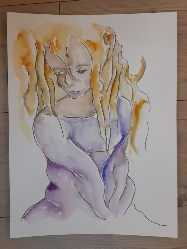
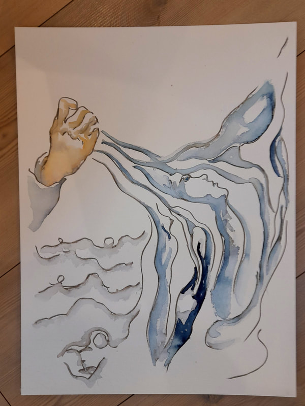
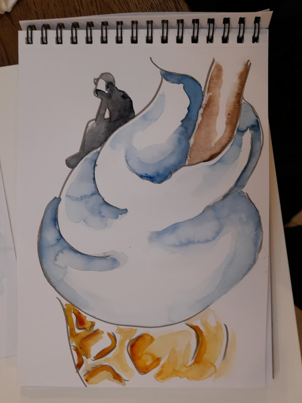
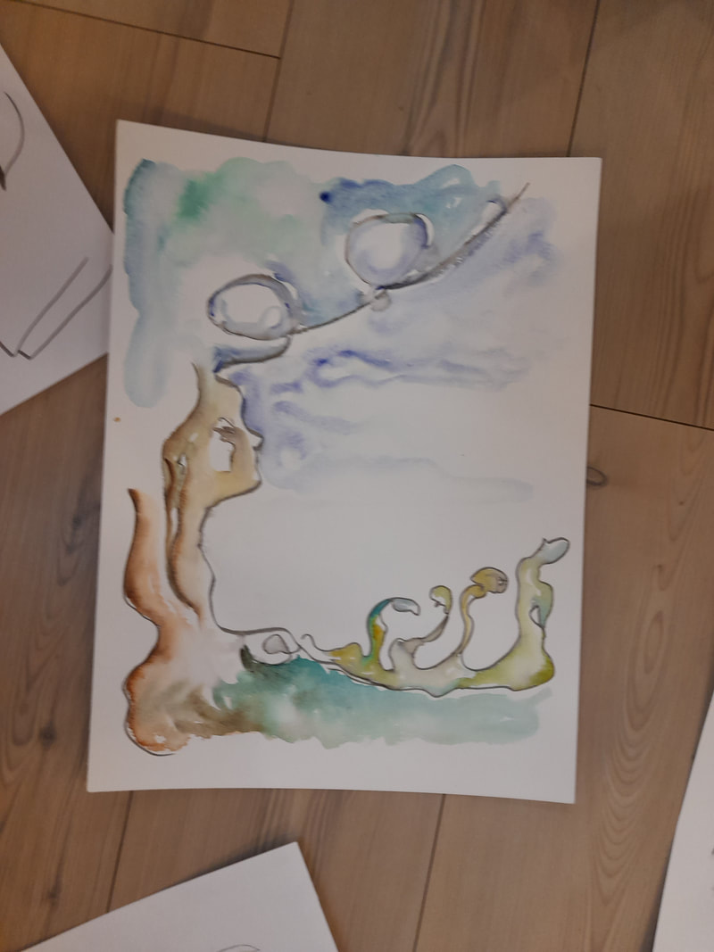
Here we are, I have reached the end of my illustration online course. I have to say that it has been a nice experience to feel as a students again, of course in a more loose and creative frame than when I was actually a student. Being a student, when I was actually a student, was quite a traumatic, neurotic experience especially in high school, it was much better at university ;) Anyway, I have completed the course in illustration and it was quite interesting. I felt reassured in what I can do already, but also challenged on a few things I need to improve, like becoming better at simplifying my composition and use desaturated colors. I was asked to explore character design in different ways, and nowadays a character in the media has become more than ever a political statement, with respect to gender, race and body shape. Certainly a discussion we should have had, but it has taken a dark aggressive tone, which is dividing people more than uniting them. I believe that it has been forgotten what was the whole point of discussing this topic! As I am always inquisitive regarding the historical origin of what we experience in the present, I started reflecting on how human identity and the perception of the divide between body and mind has always been a topic of contention across time and culture. Every single culture in the world, since the beginning of civilization has fumbled with the notion of what make people, is it their body? Is it their mind? Personally I am aligned with theories of embodiment and sociomateriality, as our mind is an expression of our bodies, a material reality on which we can exert very little control. Our mind is stimulated and think because of the sensorial stimuli it responds to, without the body there were be no knowledge and no thinking what so ever. What an intelligent being can think of without sensorial stimuli? The visual arts are born from a drive towards representing and capturing reality and aesthetics, which is a challenged notion in the art world, is still a drive for most people in appreciating a work of art, we find aesthetic in harmony of forms and colors and then we can argue about which aesthetic and how we individually or as culture relate to it and discover new unconventional forms of aeshetics, but it is aesthetics nonetheless. Notions of social constructivism has been pushed to the absurd belief that even physical reality is a social construct, but that is not true, if we could bend the laws of physics as we wanted, we would have already found renewable and reliable sources of energy that are gentle towards the planet, but no matter how we like to believe that, it is not the case yet, more work is needed! Anyhow I came to think more about how the definition of human identity, destiny and role in the world, are not a new issue for people and it has been debated across many cultures. However, the notion of what it means to be a woman is stronger recurring theme, in relation to how do women and men differ or how similar they are. Where does the duality of gender come from and what does it mean? Biology has good answers about the topic, but on a cultural and psychological perspective, these are not satisfying as they do address the individual quest of what is "my" or "your" role in the world. Looking at human kind from an evolutionary and gene-related perspective, is too abstract and distant from us, it makes us feel as we as individuals do not count, so we are bound to search for our answers somewhere else, and often this search leads to mystical explanations which are more misleading than useful. In general, being a weird kind of antisocial female, who was often a tomboy, just because I did not want to bother with societal claim on women and demands for beauty and seductiveness, all useless stuff that were not worth the effort, I believe that it is up to us to construct for ourselves, in collaboration with our fellow humans to define who we are, not through claims, but through actions. Striving to be our "best selves" is our duty towards ourselves and to the others around us, through cultivating knowledge pursuit, nurturing our talents and helping other through our lives. During the course, I have started sketching a series of marker drawing that I call MELTING WOMEN, as a metaphor of: The constant making and remaking of the women essence across different culture and Our own autopoietic process of self creation, in our pursuit of gratification in life, struggling to find our place as individuals and challenging ourselves in our pursuit of knowledge.
 To work on this theme, I went back to what I found fascinating when I was a young girl: the dancing body and the forms of wood and rocks. I found some nice reference from pictures of modern and contemporary dancers online, I practiced some spontaneous gesture drawing from images of Martha Graham and Mary Wigman, who were inspirational in my youth, when I was practicing dancing myself, and other unknown dancer. Their bodied are wrapped into heavy long dresses, keeping them down and attached to the ground. Their dresses forms undefined, folded shapes, that seem to trap women as making their figure melt with the ground, this is what I feel the cultural definition of women is doing to them, depriving them of the individual to discover and also decide how they want to be.
I hope you will enjoy my sketches and thanks for stopping by :) Bertie XXX So here we are, the second week of my illustration course is gone and the theme was character design. I was hoping to get new inspiration for my class in animations and prototypes for game development, which I will teach at Tech in the spring semester. And actually, I found some good tutorials and ideas from the course but also from my family, both my husband and daughter. The main challenge I have with my class is that students do not sketch enough, they should just draw as much as possible, inventing characters, items and sceneries, become familiar with creating by sketching, which is the hardest part. Specifically concerning characters, it is interesting how characters can have a very minimal look, and the computer helps a lot with modularizing your sketches and animations, but good ideas for characters need to be nurtured. It takes time to create a coherent character, with an identity and a back story, and physical looks, clothes and items that help communicating the characters' identity and history. Anyhow I was hoping to get new inspirations regarding illustration technique, for my own artistic practice, as well as for my teaching. In fact it was interesting to interact with a professional illustrator and get through the assignments. Unfortunately I did not have much time to work in details at my assignments, so I focused on sketching and explore potential characters. In order to ground my thinking I started working on characters based on my daughter and myself, filling pages of the sketchbook I bought for the course. Of course the elderly looking woman with glasses is based on myself ;) 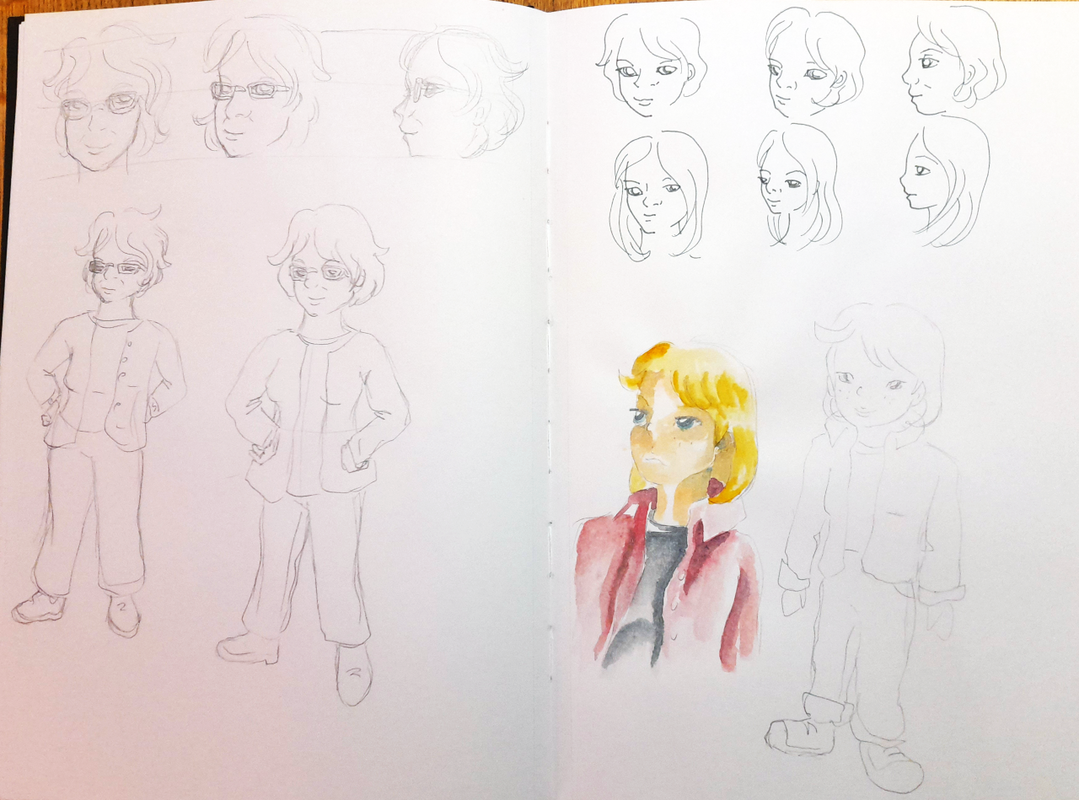 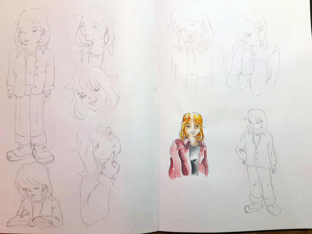 Here I focused on exploring facial expressions for the girl character based on my daughter, a sporty tomboy with mid-length hair, wearing shirt over a large T-shirt. As assignment we had to make three drawings of our character while: 1. walking  2. Reading 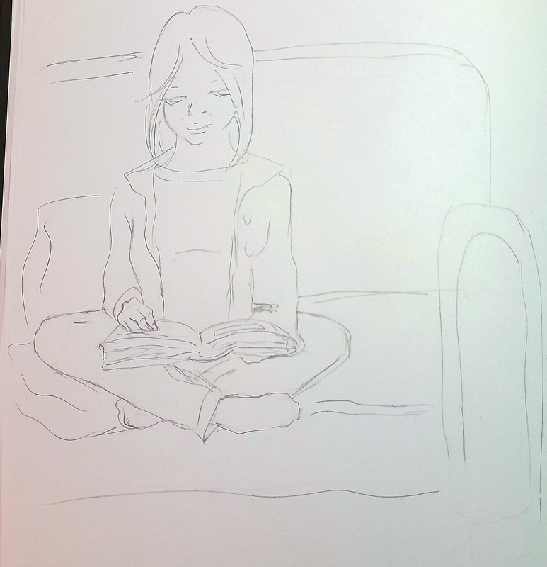 3. and talking to someone - in this case I imagined a teenage girl frustrated about something and talking to her mother asking for help or just to burn some steem. 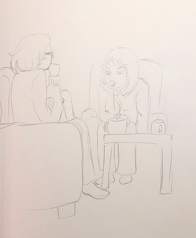 In the meanwhile I explored characters of other ethnicities than white, as it is a hot topic at the moment and our tutor asked us to try. So I searched for some reference pictures online and I started sketching in a portrait-style. As I said, since I was busy at work, I focused on sketching to explore as much as possible different characters. Here are attempts at an old black man:  I worked at a black ballerina character, inspired by an artist from English National Ballet.
And finally I worked at a naturalistic theme, where I explored the design of an Asian girl imagined as a gingko fairy. I always find gingko leaves beautiful and poetic, especially in the gracious way they become yellow. These leaves are shaped as a fan, narrow at the top and broader at the bottom, where their shape ends with a wavy line. Moreover, these leaves seem to get yellow starting from the broader bottom, where the color quickly transitions from yellow to a warm brown, in watercolour terms a burnt sienna, while the yellow shade spreads from the rim up to the stem. In my sketches I imagined the leaf as the hair of an Asian girl, here is the initial sketches.  And here the final ones on watercolour paper. 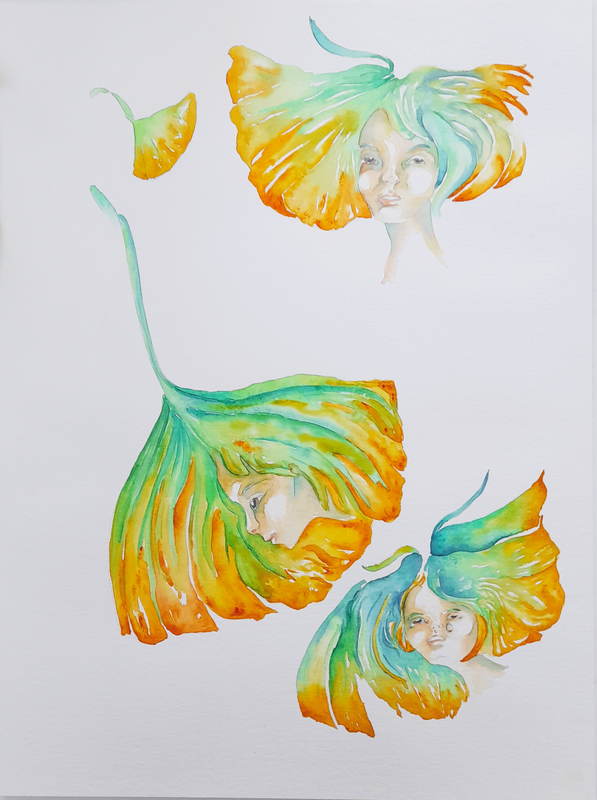 For next week I have to work on a layered scene and on a mockup for a fairytail and I will post about the results.
Thank you for stopping by Bertie xxx Unfortunately I had so much to do this week, that I could concentrate on the assignments I received from my illustration teacher as I wanted to. The them of the week was reportage illustration, we should image to create works for travel magazines. As a result, my style is not as tidy as I wished, but it became more wonky and comic-like. In the end not too bad, I achieved a vibrant colour palette, with interesting shades, richer than in the pictures I took as references. I also got good feedback from the teacher, who seems to be concerned with getting illustration that are less detailed and more fresh. In fact perfectionism and desire for too many details, that can end up competing within the final painting. So she actually captured something that I would like to improve. However, I love doing detailed watercolour work, when I make it it makes me feel great, like a master ;) I am inspired by great works from the past, like the illustrations of Swedish Carl Larson or British Beatrix Potter, but also the naturalistic work of German Ernst Haeckel provide a great source of inspiration. In general my drawings were appreciated for their consistency in style, lively colours, for capturing the action with close ups and broader scenes, making the drawings look immediate. Here are examples of the drawings I made about the town of Ravenna, an Italian town famous for being the capital of the Ostrogoth empire in the period of Late Antiquity circa 400-500 AD.  This is a view of the garden around the Mausoleum of Galla Placidia, an Ostrogoth Empress. It is one of my favourite monument in the town, surrounded by a peaceful sunny garden. The monument is sided by a row of slender umbrella stone pines, as if guarding the dead Empress and her celestial home. Inside are displayed the most amazing mosaics, lapis blue being the most intense and distinct colour on the walls. Repeated all around the square layout of the inside, the motive of the two doves by the baptismal font. I worked on a warm-pinkish palette for the Mausoleum, to give the monument a more gracious image than plain yellow and grey shadows.  Above a delicacy found in the area: a piadina burger. Piadina is like an Italian tortilla, filled with a charbroiled burger, cheeese and vegetables. Quite an interesting experiment ;) Both works presented above were painted on watercolour paper, which can better tolerate wet-on-wet technique and washes. Underneath a view on the marina, which lays a 30 min drive from the town center. I was fascinated by the strip of rocks dividing the sea, on which people would occasionally seat on. I saw the rocks as faces appearing on the water surface, can you spot the face, nose and eyes? I liked to play with different shades of blue: Phthalo and cobalt for the sky, phthalo and Ultramarine for the sea. I tried to convey how sea and sky almost merge by the horizon, the scenery being dotted by swimmers of all ages. I drew this piece on my sketchbook, so it was a smooth but thick paper type, which can tolerate light washes and wet-on-dry technique, but can lead to a dotted texture in the colors, especially visible in the sky. 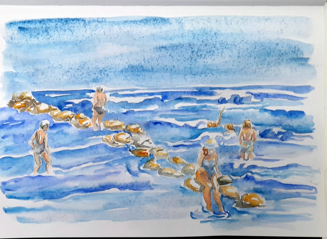 Finally I made these digital illustrations of the map of Odense. I drew the layout of the city streets from the centre to the outer ring surrounding the centre. I experimented with contrasts, I marked the profile of the blocks and streets with dark grey, and I filled the blocks with violet, the parks with dark green and the river and see with a primary blue. I added the building of art museums, trying to minimize details and playing with contrast, like the yellow and red-orange for Brandts modern art museum and Hans Christian Andersen's house. For the building Filosoffen I used a light and a dark grey and black, plus I added yellow and violet for a poster and lines on the building. In this way, white, yellow and violet remain the main colours creating contrast in the map. 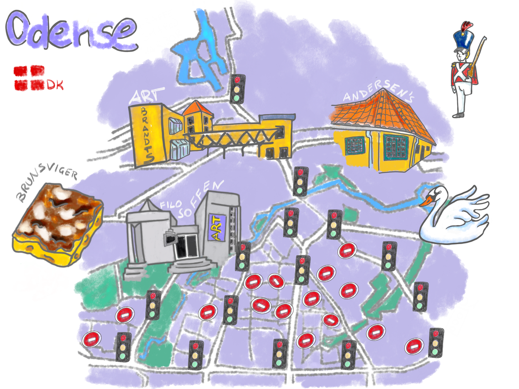 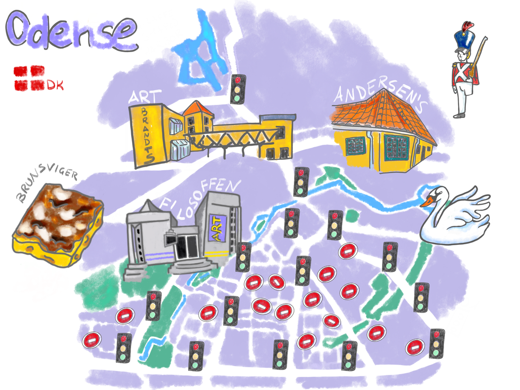 In the second map I have erased the grey profile of the streets and the blocks, turning the streets into negative white spaces. In my view, this makes it for a cleaner layout, reinforcing contrast and erasing elements that could compete for the viewer's attention.
I have added a one-legged soldier close to Andersen's house, to refer to the fairytale the Steadfast Tin Soldier, I have added a swan to refer both to the fairytale the ugly Duckling and to the fauna that people can actually experience in the parks. Finally I have added a square piece of Brunsviger, a cake that is actually the pride and joy of Odense and the island of Fyn, so much that there is a Brunsviger day ;) The cake seems like a sweet soft focaccia covered with a sweet and shiny cream, spiced with tones of cinnamon. To add a bit of irony, I added a lot of traffic lights and one way signal, to hint to issues with traffic, something many Danes complain or make fun of. It is actually not so easy to find your way around by car, with the many one way or closed alleys and the many traffic lights. One of my colleagues from the university recently complained that to send a table cloth to clean after an event, it took her half an hour to reach the cleaner, just driving around the many one ways streets and traffic lights, it was quite funny, if you read my post you know who you are ;) I hope you have enjoyed this little article, I will publish next time about the tasks for week two, where the theme is character design. Thanks for stopping by Bertie xxx Thanks to the generosity of the head of my department, I have started this Saturday to take an online course in Illustration. The course is held by the University of the Arts in London, it is online and it will run for 4 weeks, basically all November. The tutor is a nice woman of Japanese and American origins, who is working as a freelance illustrator and she is a graduate from UAL. My goal with this course is:
From a professional level, I really hope to get new inspiration for my teaching and my art, hoping to find out how I can work more as an artist and illustration. At the same time, I wish to become better at illustrating the prototypes and games I do in my research together with my husband. Problem is, I feel constrained when I get tasks from others. Currently I am in the process of finishing my work for Nelle's café, which has been lovely as I have worked with topics and styles that come natural to me, like food illustration, urban sketching and details, experimenting with smooth hot pressed and textured cold pressed paper. On the other hand, I would like to get to illustrate books I like, currently I am discussing a children book project with a colleague of mine and I dream of publishing my own visual poetry booklets and let's see how it goes. Another research project I have in mind is to develop a method and write a book about how to learn and employ drawing for ethnographic data collection and analysis. I published already a chapter in Danish on the topic and I wish to deepen the subject :) Anyhow here are my first sketches for the course, first our teacher told us to draw from a picture showing an English breakfast menu with coffee. We had 30 minutes and we could use any style we wanted, here is my sketch: 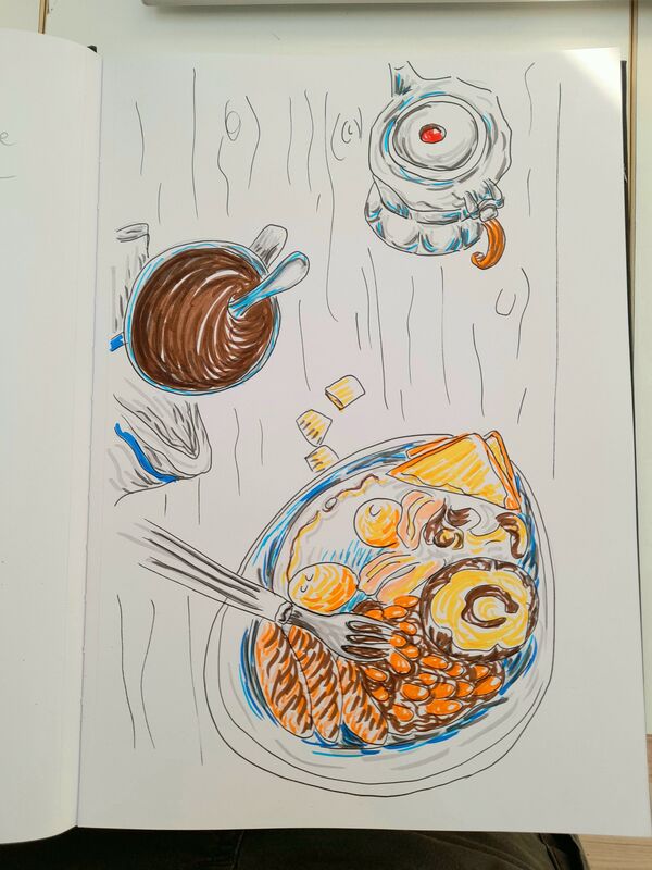 I quickly sketched the scene with a thin black marker, and of course since we had little time I panicked and got the shape of the dish wrong ;) It was fun to draw the food, the cup and the coffee pot with its polygonal, almost circular, shape. I filled the shapes with strokes of coloured markers, I technique I like a lot. But as I did it very quickly... hmmm... it did not come out so well, luckily I got many likes on Instagram, I wonder what my teacher will say ;) And then for the coming Friday we were asked to start a sketchbook and draw people in different attitudes, possibly from life. Saturday evening I started sketching from my holiday pictures, just to warm up, here is a couple from Odense relaxing at Nelle's café:  I went on sketching from pictures I took during our holiday in the Netherlands, I selected a large view of Dam Square in Amsterdam, where small groups of tourists casually appear in the picture admiring the scenery. In the 1st one, I love how the group of ladies was framed by the two black umbrellas, but in an asymmetric dynamic way, it naturally makes for a strong composition. Moreover, the two middle ladies with the red and yellow jackets provide a lively focal point, but without forcing a static central symmetry.  Here is the 2nd, a trio of tourists look around. The group includes a middle aged woman and man, the woman is taking a pictures, while the man is holding a sheet of paper (a map?) while chatting with a youngster wearing a hooded wind jacket and holding something looking like a black camera. I thought it could be a family, strolling around Amsterdam.  Today I had a chance of doing some real urban sketching at Odense Storm Pakhus, a street food venue placed in a refurbished ex-warehouse. It is a very popular spot, not especially cheap, but with a nice variety of food from all over the world. While waiting for my pizza- yes I was a bit predictable and boring today as an Italian in Denmark, but I already had their chirashi far too many times recently ;) - I observed the people around. In particular I got intrigued by a couple of girls, probably two sisters, the elder around 7-8 and the younger around 5-6 years old, drinking cola and it seemed like looking at a book together. They were both pretty with their golden hair and sweet fresh faces, the younger wearing a pair of pink glasses. Funny note, her hair were messy, indicating that previously they must have been engaged in some wild game like climbing or jumping and there is a small nice playground not far from where they were sitting.  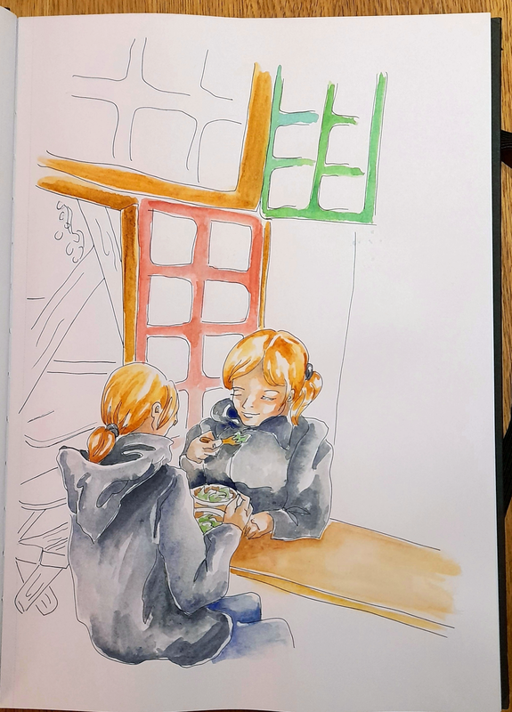 In the last sketch I made, I drew a mum (right front view) and a teenage daughter (left back view) enjoying a light lunch together. I am at a stage in which my teenage daughter wants to spend more time with her friends or alone sketching in her room, than with me and I am quite sad about it. So the scene really spoke to me :)
I liked the serene mood they displayed, comfortably sitting in front of each other, eating what seemed to be the same salad or poke. They had the same straight golden hair, tied in a ponytail. They both wore black raincoat, the girl wore a sport jacket the mother had a more tailored coat. I was surprised they were both still wearing their jackets while eating, could it be that they were coming from a long cold walk and still needed to warm up? Anyhow, I have a few other exercise to do for the course, to be uploaded next Friday and I plan on drawing some more people around. One thing for sure, while making these sketches I was experiencing how learning to trust your lines is a fundamental achievement in drawing practice, no matter how polished or rough your drawings are going to be, a confident line will appear beautiful and rich in purpose. Your hands will project your confidence or insecurity to your lines and this will result in a good expressive work or in a messy one, this is an important lesson that is still challenging for me and that I must pass to my students. Thanks for passing by Bertie xxx It has been a challenging time and I can see that I have posted more than one month ago, just after the live event at Galleri Knægt, that is too bad :( Among the many tasks from work, I experienced a creative block! I was basically exhausted and as it always happens now and then I got to doubt what I was doing with my painting, yes whatever, it happens now and then! I wanted to paint new natural details, but at the same time to draw about people and their lives, like urban sketching style, but also with a surreal twist, like I love to do. I mean... where could I start? In the end I just focused on working and that was it, I did not draw much. Then we went on fall break and my hubby said: why don't you draw a comic book of us exploring Groningen, while we are exploring Groningen in real life? I had two very good sketchbook, one with fine thin paper for delicate works, and then other with good thick watercolor paper. I did not want to waste any of those, so I bought a cheap notebook A4 with plain paper. So I was finally free to experiment without fearing of misusing good quality materials. I took tones of pictures, as I always do, of the city, I love Dutch architecture, I must say I prefer the old one. The buildings are very inventive, with decorations, lively colour contrasts, and huge arched windows, what not to like? So, sketching around in between job tasks, I finally did it and here it is: Andy & Emma - searching for books around Groningen. To answer to the question in the title, what do I do when I have a creative block? This time I tried to take myself less seriously:
- I bought a cheap notebook - I engaged with cheap materials: markers - I just sketched from life and pictures directly with markers - I sketched in a rough childish kindergarten style Have I solved it? Not sure entirely, but I ended up with a silly product, silly but done, so in a way, I got back on the sketching horse and you can see and read the result on the above slideshow ;) Thank you for stopping by Bertie xxx
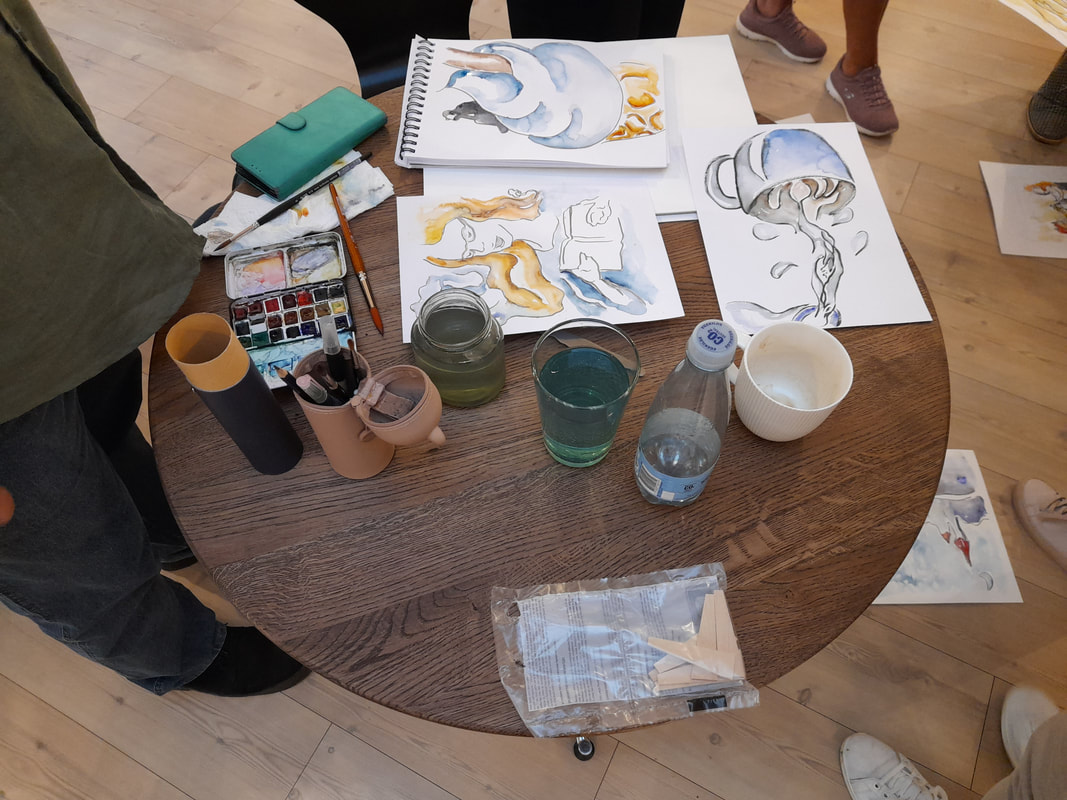
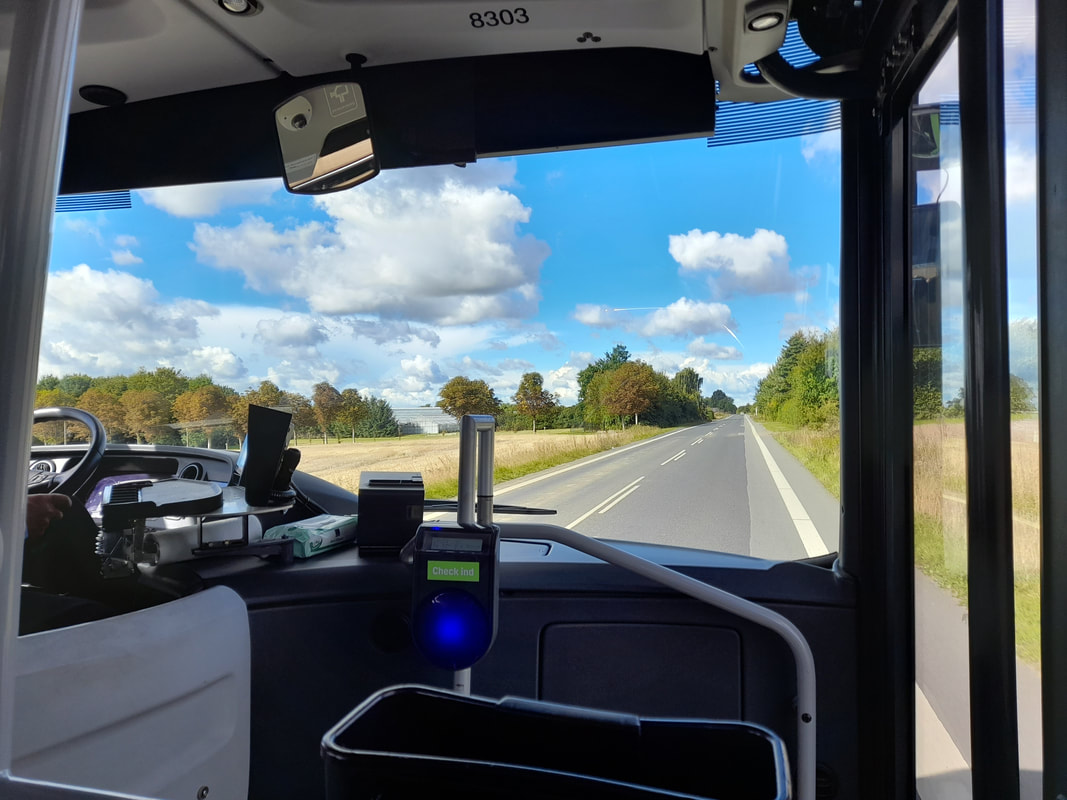
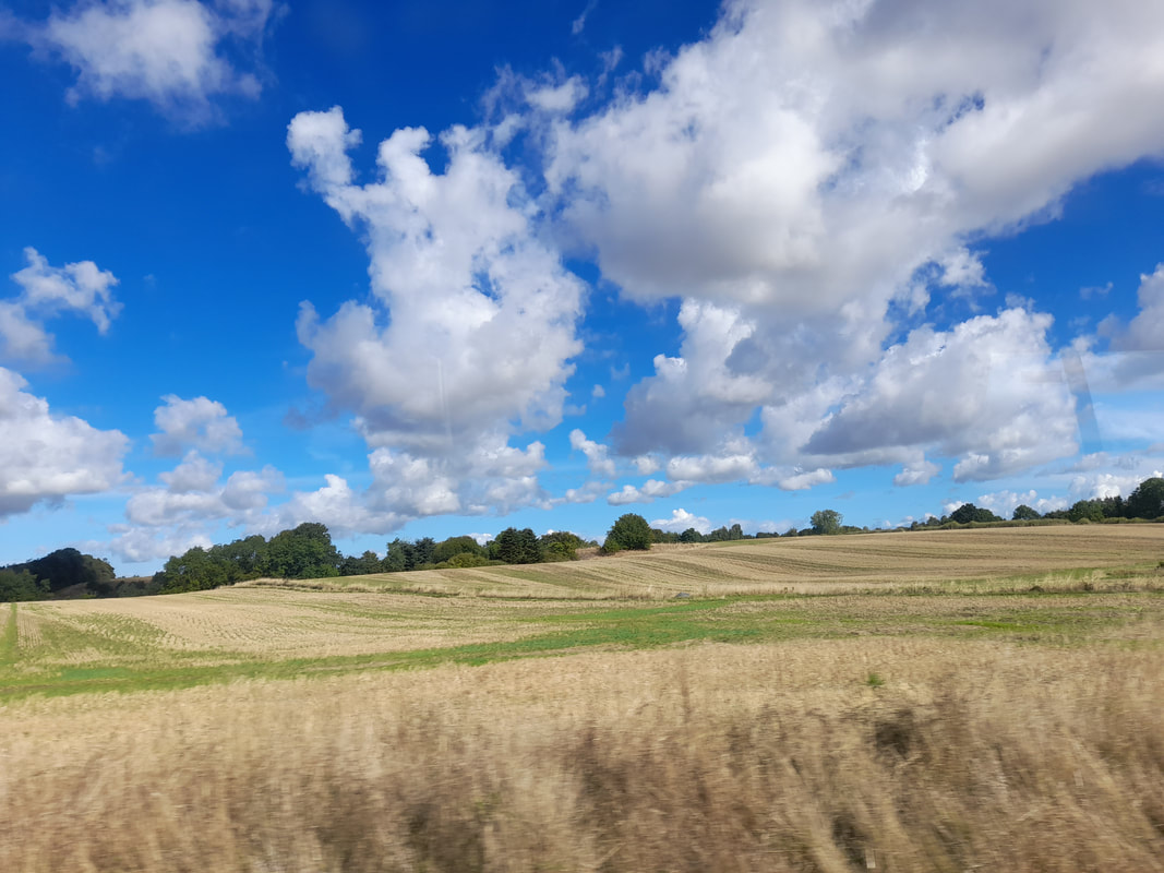
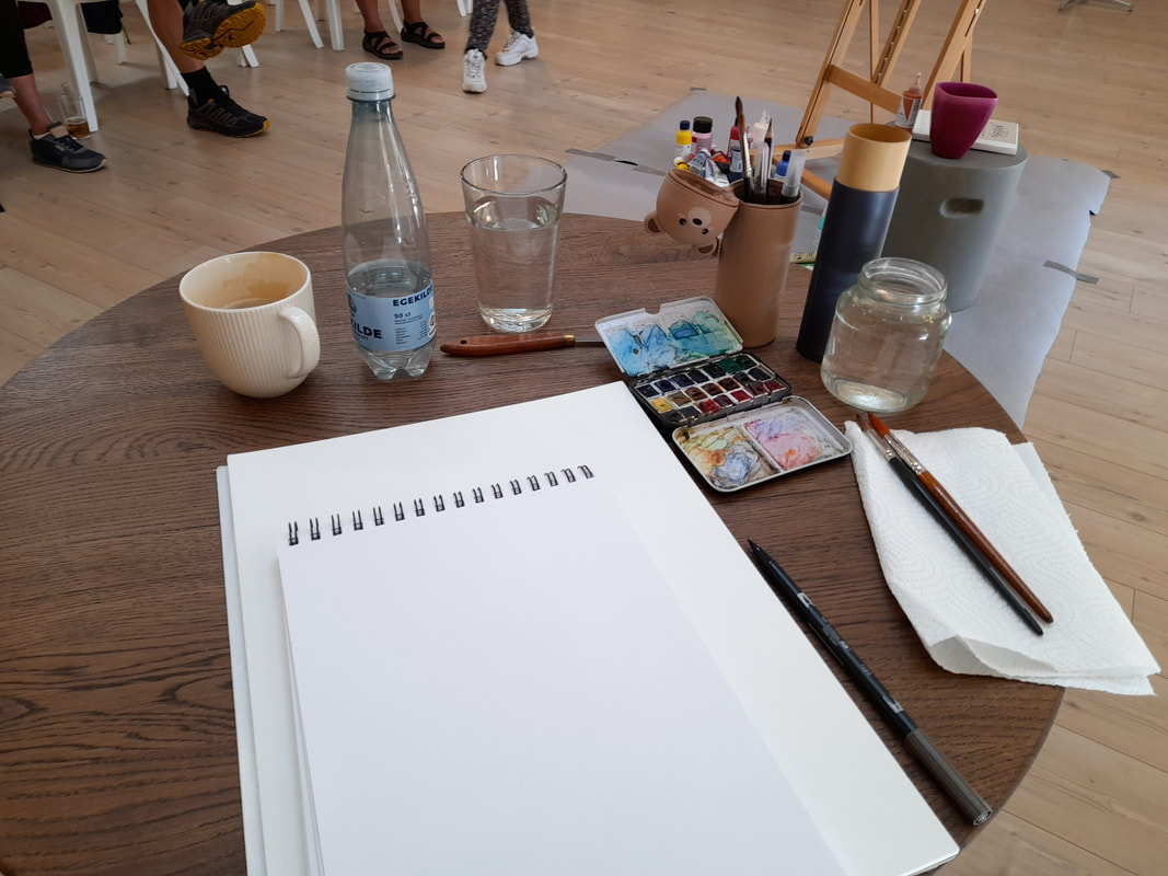
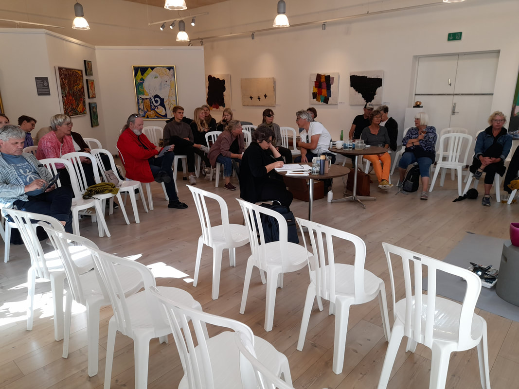
So yesterday was the big day and I went to Sprogense at Galleri Knægt and obviously nothing ever goes as expected. First of our car would not start, on a Saturday morning, right? When the mechanic is closed and you cannot get a substitute car for a million :( So my hubby and I walked to the shopping center got a little breakfast thinking on what to do, while the daughter slept quietly at home. In the end, we settled for checking the local bus, it seemed like the obvious way to go, and the bus was actually good. I must say that on the Fyn island, extra urban buses work better than the urban buses in Odense ;) So in the end, I packed my material tight in my backpack, I took: 1 A4 Talens mixed media sketchbook spiral bound 2 A3 Hanemühle watercolor sketchbook glued 3 Teddybear pencil case with water based markers, 1 black 1 grey 4 Palette knife to cut the glues watercolor sheet 5 watercolor pans my usual portable palette 6 Three good brushes 1 kolinksky 6 and 1 one large synthetic 16 to quickly cover large areas 7 a glass jar for water 8 A 1/2 liter water bottle, not to drink but for the colours just in case ;) We got the local bus to the shopping center, changed for the tram to the bus stations, quite annoying that we do not have direct connection anymore, and then the bus to Bogense, we arrived one hour earlier so that we could take it easy. The weather was lovely as well as the view on the countryside :)
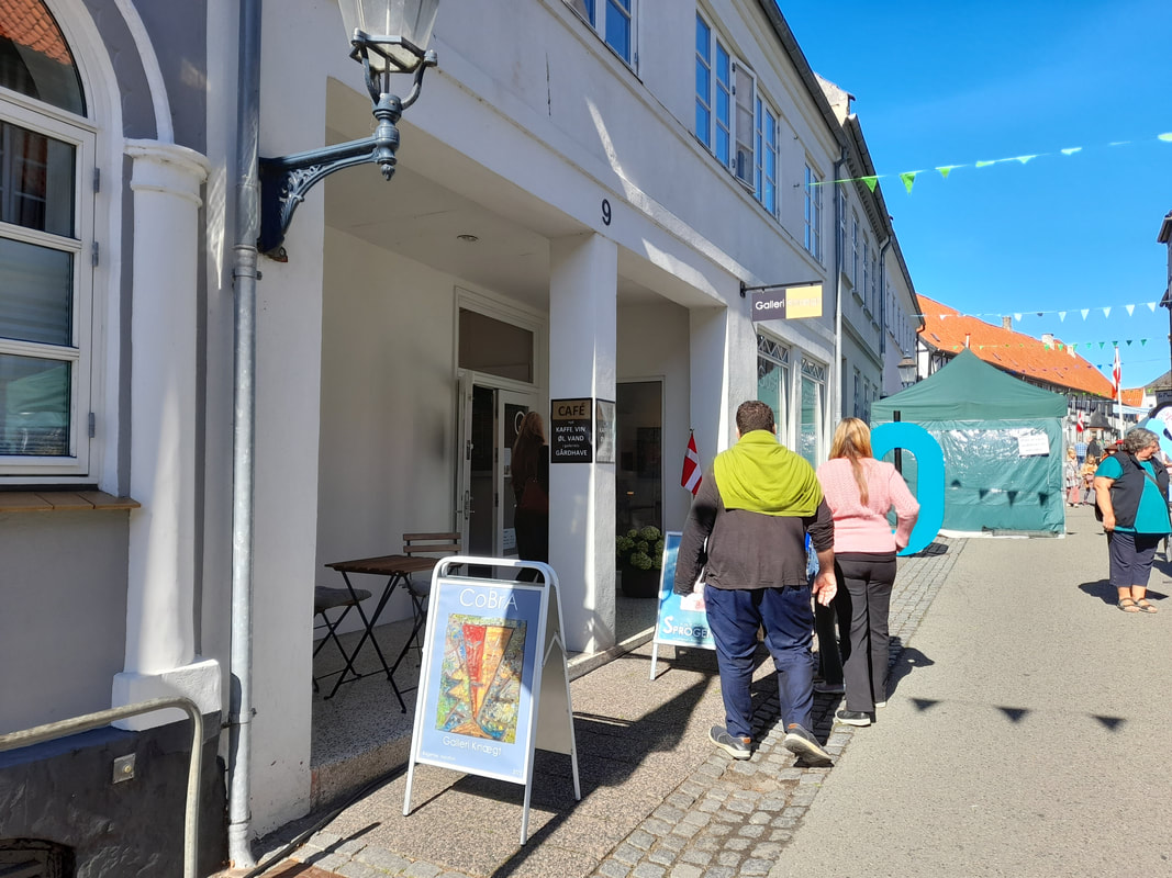 We took a walk in the center and then I came back to prepare my stuff and I met the managers of the Gallery, two kind men, and the other artists, two other nice men, interestingly we all had different styles, but we were all representational realist artists, which was surprising as often abstract art is more common at such events.
As people was entering the room, I warmed up doing some quick sketches. During the event a guitarists played his guitar and an actress read passages from famous Danish writers like Vita Andersen. I got very focused and tried to condense impressions I had from the stories being read and the music, so I ended up mixing narrative elements with the abstract recurring patterns from the music, which was shifting the same patterns. I was surprised how much I could get from the Danish text being read, but in the end I was very tired. The participants seemed impressed by how quickly I was painting, and I got two sold in the end :) Here are the paintings I have sold and some images of me talking to people about my paintings and my table during the break: 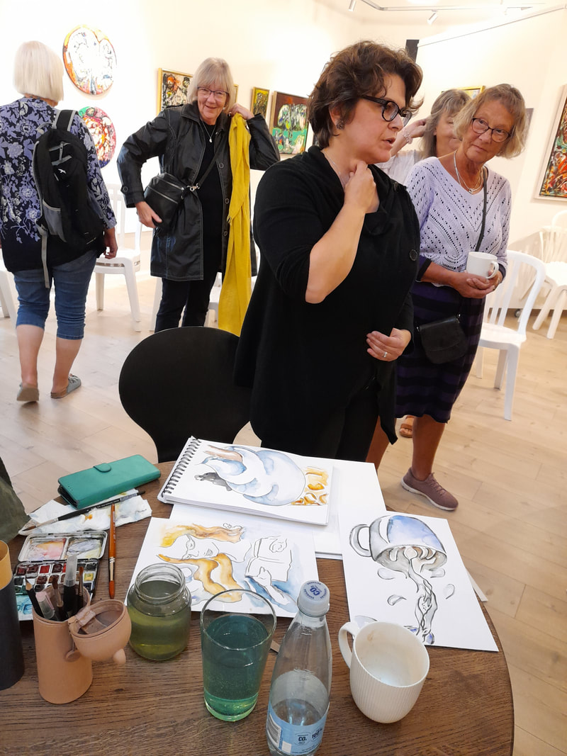 Here are some of the others:
My goal was to create a series of paintings so I felt pressured by time. So I am not totally satisfied by the details, some hues did not work so well with textures, I guess I know better which colors I must buy and avoid next time I go shopping ;)
Thank you for stopping by Bertie We are getting further into fall, actually not my favourite season, I fight with the will of getting out, bike and stuff because of the Danish rain and windy weather, sour throat and ice cold hands is my fall-condition. And I mean that word FALL in English is already hinting at something sinister like... falling, falling short of resources, going back to work and so on... Anyhow some good things are happening, together with my colleagues we wrote a methodological book for our Media Science students and now it is being published. My contribution to the book is one chapter focusing on drawing and live sketching as an ethnographic practice for gathering data in the field during observations and for analysis and representation of data. My chapter leverages techniques and methods from the brilliant book by Betty Edwards: Drawing on the right side of the brain. This book is a classic and has been a game changer for many, as I have discovered participating in discussions with various online groups of painters and illustrators. The method proposed by Edward is especially effective in training the eye to perceive reality as it is, capturing relevant details from small subject to great scenes. The more I practiced these technique the more proficient I became as I gradually acquired more control on the subjects I was drawing from reality but also from imagination. My aim was actually to create drawings from imagination that could have the same degree of authenticity that you can see in well done drawing from reality. I think I have achieved that goal, but there is still room for improvement, for instance in keeping some of the spontaneity of drawing from imagination, not getting too stiff, so my goal now is to develop my technique so to be able to fly back and forth from reality to imagination. In my chapter I try to show how drawing can actually become simple and approachable, when knowing what to do, some stuff is impossible to acquire just by trying. In that respect I reference to some artists, who are active online in the urban sketching or sketchbook movements such as Koosje Koene (https://www.koosjekoene.com/), I am personally fond of her Draw Tip Tuesday videos on Youtube, and Danny Gregory. They both offer tutorials aiming at showing how drawing from reality can become simple and enjoyable also for adults who do not have formal training. In this respects, their online resources complement well Betty Edward's method, in terms of enabling adults to draw from reality without to many worries. I see my role as experimenting with drawing in capturing reality from experimental settings and in elaborating an ethnographic drawing method, that could appear non-intimidating to Media Studies students without formal training in drawing. In that respect digital technologies can provide valuable tools in enabling editing and cleaning up simple sketches, to make them usable as research documentation. At the same time I am interested in art as a social practice, entangling several artists and makers, and also their audience. The live event at Galleri Knægt is approaching and my plan is to practice some sketchy watercolor paintings, drawing with a brush pen that can fade with water and then outline shadows and lines with watercolours. I have started preparing my equipment like: 1. A3+ Mixed Media sketchbook 2. Checking my colour palette 3. Get a larger brush to use during the event 4. And practicing forms of quick watercolouring as I have applied it to these paintings.  Here I have tried to work further my technique, in order to feel more confident in my line work, reducing details, but keeping some nuances and details. In the painting above, I tried to practice to do a quick sketch with my grey brush pen and then simply adding water and simple layers of colours. In order to do the painting quickly, but still giving it a fine touch, I have painted geometrical shadows, which in the end gave my sketch a sculptural look. I think I might want to explore this further ;) Here you can see the unfinished and the finished work: 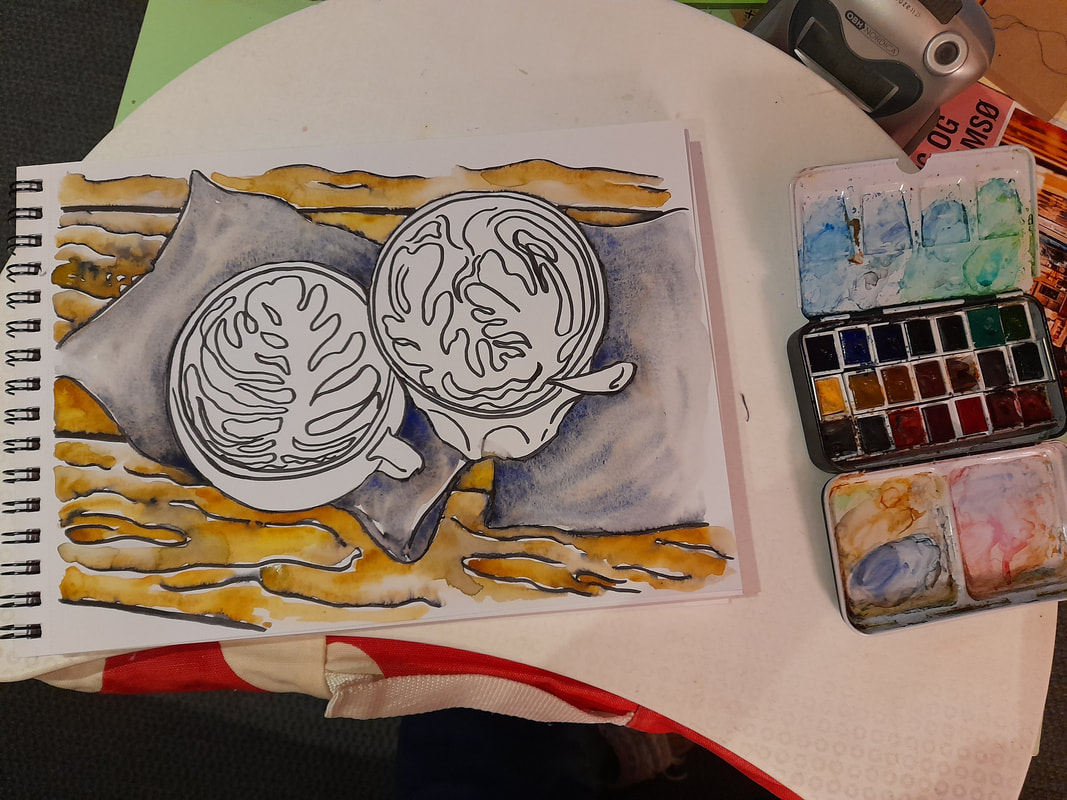  I was lucky enough to start a cooperation with Nelle's café in Odense, where I was asked to create a series of watercolour with "Latte Art" theme. Besides the challenge of making time for it, I am enjoying any minute. Drawing food has always been exciting for me, maybe being the daughter of a patissier, I see in food more than a still life motive. I see life, organic forms, dynamic lines and warm lively colours.
Accessories like ceramics, in this case cups, and the wooden tables have always captured my imaginations. Wooden lines are like waves in a golden sea, flat yet wildly dynamic, looking right at you with its dark eyes. Ceramics, glass and metals have all reflecting qualities, they enable you to look at yourself, admire how natural or artificial lights hit their smooth surfaces and create thousands of shadows and waves of movement, like an unstoppable dance, ever changing through the objects being moved by our hands, but also by the changing lights during the day, into an eternal shining dance. In this painting, I worked at the curves of the wooden table as if they were a counterpart to the curves of the foam milk inside the cappucino and latte inside the cup and the glass. The foam milk creating dynamic, soft and articulated forms of aquatic vegetable life, seaweed moved by the currents. The cup and glass providing stabilizing area together with the grey napkins, containing and separating the currents of the wooden lines and of the foam milk. I drew this panting with quick linework with a non-water resistant brush pen, and I tried not to worry too much of the precision of my lines. And then I have worked with a 4-size kolinsky brush. I have started with adding water along the brush pen lines, creating grey shadows and textures on the paper. And then I gradually added colours, to create nuances and bring the drawing to life. The wet ink of the brush pen contributed to the raw organic appeal of the painting. I hope to be able to work in a similar way, this Saturday at Galleri Knægt :) Thank you for stopping by :) XXX Bertie Currently I do not have new paintings to show as I am working at a couple of commissions and I cannot show at the moment. But the preparations for the live art event in Bogense at Galleri Knægt are in full swing and here I would like to share the official brochure of the event, which is entitled: Sprog, Toner og Billedsprog. In English it could be translated into: Language, Tones, and Visual Language; a name that well represents the essence of the event and I feel very flattered to have been invited to participate as visual artist, with my odd watercolours. 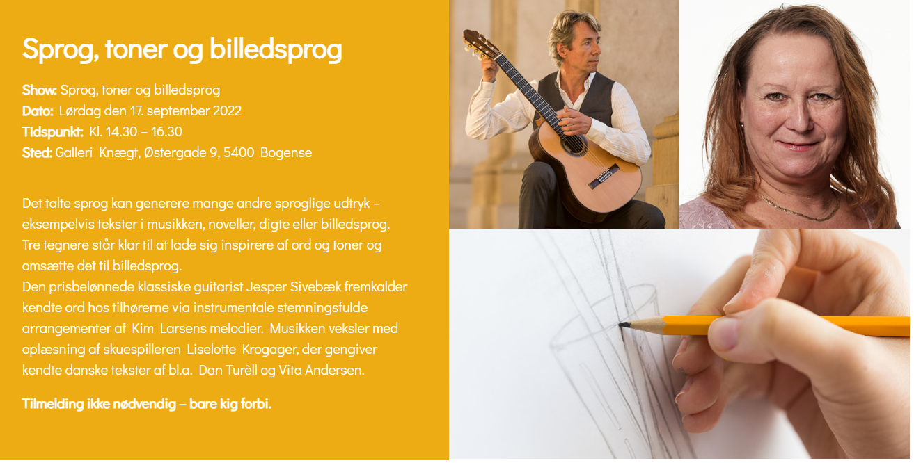 Here you can find the local newspaper, which presents the whole festival, that is called Sprogense and includes a series of other events, including the one at Galleri Knægt: https://www.e-pages.dk/jfmadhoc/1645/
Currently I am warming up for the event, improvising with paint and quick wet-on-wet technique, but I am not so happy with the results, so I will show some later on ;) Thank you for stopping by Bertie xxx So I am finally back to work and all the daily stuff. There is a new wind at the horizon, with new ideas and changes in my daily work as a researcher, as our department is going to be restructured. During the summer I took some time off, basically to think about how things are going, and actually I am becoming more interested in exploring sketches as a form of poetry and narrative, so I would like to develop further my artistic investigation on that front. I have been sketching in nature, at the beach and around in cities. On the other hand, I did not sell any work on my last exhibition in Filosoffen, but I received some nice commissions. The first commission I would like to mention is an invitation I received from a nice art gallery placed in Bogense, north of Fyn, to draw-paint live during a poetry and live music event and be paid for it! What's not to like? ;) The idea is to create an artistic performance, combining music, acting and live sketching, where painters will paint on the spot according to their emotional experience of the music and the acting. The event will be at Knægt Galleri in Bogense on the 17th of September from 2:30 to 4:30 pm and I am looking forward ;) The gallery is named Galleri Knægt and it has a good reputation in Denmark, so I was quite surprised to be invited. Here is the link to Galleri Knægt: https://galleriknaegt.dk/index.php/arrangementer/# And the link to the online brochure: https://www.e-pages.dk/jfmadhoc/1645/
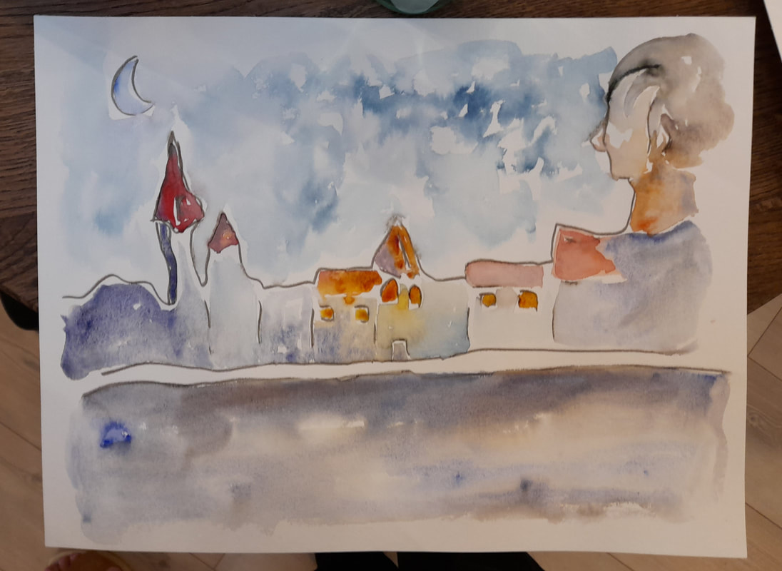
Here are a few images from my sketching by the sea :) A dead leaf, hiding the appearance of a bird and a sketch of a stone resembling a sea creature in the current  Thanks for Stopping by, I hope to seeing some of you in Bogense :)
XXX Bertie |
AuthorFreelance illustrator and painter. Archives
May 2023
Categories |


 RSS Feed
